
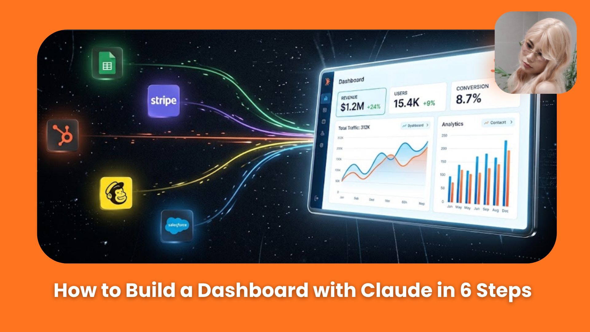
With the right setup, Claude can help turn your business data into a living dashboard that stays updated day after day. Here’s the surprisingly simple workflow behind it.. Ai Fire 101, 🔥 Ai Fire Academy.
TL;DR: To build a useful AI dashboard with Claude, start with one clear goal and a small set of metrics that actually change your decisions. Connect your data sources, test each one before building anything, sketch the layout, then automate daily refreshes so you never have to rebuild it by hand.
Keep it simple. Aim for around 15 metrics or fewer, one page, most important numbers at the top. Build a small version first, use it for a while, then add more only when you notice something’s genuinely missing.
What this guide walks through:
How to define your goal before touching any tools
How to cut your metric list down to what actually matters
How to connect Claude to your data sources, and why Composio makes this much easier
Testing every metric before you waste time designing
Building a wireframe first, then the visual version
Making the dashboard refresh itself automatically every morning
Table of Contents
Introduction
Your revenue is in Stripe. Your traffic is in Google Analytics. Your content performance is somewhere else.
And every morning, you’re jumping between 5 different tools just to figure out what the hell is actually happening?
That’s why I think a good AI dashboard is so useful. You bring the numbers that actually matter into one place.
And when you connect the data, you can uncover things you normally wouldn’t see, like how many sales calls came from one specific YouTube video.
In this guide, I’ll show you how to build your own AI dashboard with Claude. So every morning, you open one link and immediately know what needs your attention.
I. Plan Your AI Dashboard Before You Build It
A dashboard can look great and still be useless if you start building before deciding what you actually want to learn from it.
So before Claude touches the layout, charts, or colors, spend a few minutes defining the purpose and choosing the metrics.
Step 1: Define the Goal First
Start with one simple question: What decision should this dashboard help me make?
You might want:
-
A full view of your business
-
A sales dashboard
-
A finance dashboard
-
A marketing dashboard
-
A dashboard focused on retention, churn, or another current priority
This matters because, left to its own devices, Claude will happily give you far more data than you can actually use. A clear goal acts as a filter. If a number doesn’t help you answer that one question, it doesn’t belong on the page.
If seeing a metric would change what you do next, keep it. If it wouldn’t affect a decision, leave it out.
For example, if your main goal is improving retention right now, then churn rate, renewal rates, and customer activity deserve prominent space.
You can start with a prompt like this:
I want to build an analytics dashboard for AI Fire (my AI newsletter/media business).

AI Fire runs on a newsletter (beehiiv), a paid course called AI Academy, a paid AI Community, and a sponsor program. My goal is: every morning, open one link and see the health of the whole business, instead of checking beehiiv, Stripe, YouTube, and my community platform separately.

Right now I'd want to track:
- Newsletter growth and engagement (subscribers, opens, clicks)
- AI Academy and Community revenue (new sales, churn, MRR)
- Content performance (which posts/videos drive signups)
- Sponsor pipeline (booked slots, revenue)

Give me an extensive list of specific metrics and data points across these areas. I'll pick the ones that matter most.

Do not build anything yet. Just give me suggestions.
 |

|
At this stage, let Claude brainstorm. You are still planning, so there is no need to build the AI dashboard yet.
Learn How to Make AI Work For You!
Transform your AI skills with the AI Fire Academy Premium Plan – FREE for 14 days! Gain instant access to 700+ AI workflows, advanced tutorials, exclusive case studies and unbeatable discounts. No risks, cancel anytime.
Start Your Free Trial Today >>
Step 2: Cut the List Down
Claude will probably give you a long list. This is where you need to be ruthless.
Too many metrics make a dashboard harder to scan, and information overload is one of the main reasons people stop checking dashboards after the first few days.
A good starting limit is around 15 metrics or fewer. For a business dashboard, something like this could work:
|
Category |
Metrics |
|---|---|
|
Revenue |
Total MRR, new customers this week, churn rate |
|
Content |
Top video/post by signups, views on top 3 posts this week |
|
Newsletter |
Subscriber growth, open rate, click rate |
|
Community |
Retention rate, new member activity |
|
Sponsors |
Booked revenue this month, open slots |
The exact list depends entirely on the goal you wrote down in Step 1. Your list will look different from this one, and that’s fine.
Treat the first version as an MVP. Start small. Use it daily for a couple of weeks. Only add another metric when you notice it would genuinely help you make a better decision.
In the example we’re following, the dashboard launched with just 10 metrics, compact enough to review in under a minute each morning.
 |
 |
Now you can move on to the technical part: connecting Claude to the tools where that data actually lives.
II. Connect Your Data and Build the AI Dashboard
This is usually the part that takes the most iteration, so go slow here and don’t rush to design anything.
Step 3: Connect Claude to Your Data Sources
Go back to your metric list and write down where every number comes from. For example:
|
Metric |
Data source |
|---|---|
|
MRR, new sales, churn |
Stripe |
|
Website traffic and sources |
Google Analytics |
|
Video views and performance |
YouTube |
|
Newsletter opens, clicks, growth |
beehiiv (or your email platform) |
|
Community activity |
Your community platform |
Claude needs access to each of those sources before it can build a useful AI dashboard.
You should do this simple table before touching any connectors. It shows you exactly which integrations you need, and it catches missing connections before you’ve wasted time.
For the actual connections, I highly recommend using Composio. It works as a meta-connector. One MCP connection gives Claude access to 1,500+ apps, including Google Analytics, Stripe, YouTube, and most business tools.

It’s especially useful for analytics platforms like Google Analytics, which can be annoying to connect directly.
Quick setup: in Claude, go to Settings → Connectors → Add custom connector, and enter Composio as the name with
https://connect.composio.dev/mcpas the URL. Claude can then discover the available tools and request OAuth access to each app as needed, so no passwords get shared and you skip 5 separate setups.
Step 4: Test Every Metric Before Building
Once your connectors are set up, don’t start designing. Test first.
You want to know one thing: can Claude actually retrieve every metric on your list?
Using the connectors you now have access to, test every metric on our final list:

1. Net subscriber growth (beehiiv)
2. Open rate (beehiiv)
3. Click rate / CTR (beehiiv)
4. Total MRR (Stripe)
5. New sales/new members this week (Stripe)
6. Churn rate (Stripe, or manual calc if not available)
7. Top video/post by signups (estimated via YouTube traffic-source data)
8. Views on top 3 posts this week (YouTube)
9. Booked revenue this month (manual entry)
10. Open slots this month (manual entry)

For each one tell me:
- Which data source you used
- Whether you retrieved it successfully
- The actual number you got, so I can sanity-check it
- Anything missing, broken, or unreliable

Do not build the dashboard yet. Just report the test results.
This small test can save a lot of work later.
 |
 |
That is a good rule for your own dashboard too.
-
If an important metric fails because a connector isn’t set up properly, fix the connection now.
-
If a metric is difficult to retrieve and doesn’t matter enough to justify the extra work, remove it from the list before designing.
Step 5: Build the Dashboard in 2 Stages
Now you can actually start building. But don’t jump straight into a polished visual. There’s a faster path.
1. Stage A: start with a text wireframe
Ask Claude to sketch the layout in monospace text first. This sounds low-tech, but it’s genuinely the fastest way to get the structure right before you spend time on colors, cards, and styling.
Based on the 10 metrics we selected and tested, create a compact wireframe for the AI Fire dashboard using monospace text.

Layout:
- Top row: the 4 master numbers — net subscriber growth, total MRR, top video/post by signups, booked sponsor revenue this month
- Section: Newsletter — open rate, click rate
- Section: Academy + Community — new sales/members this week, churn rate
- Section: Content — views on top 3 posts this week
- Section: Sponsors — open slots this month

Keep it on one page, minimal scrolling. I want to review the structure before we build the visual version.
That’s exactly the approach used in the example dashboard: monospace first, visual second.
2. Stage B: build the visual version with clear design rules
Once the structure looks right, give Claude specific design instructions. Vague instructions get vague results.
There’re some rules I use a lot:
-
Most important metrics go top-left, because that’s where eyes land first.
-
Keep vertical scrolling minimal, ideally so the whole thing fits in one view.
-
Short labels only. Claude-generated dashboards often add long descriptions like “Total number of customers who cancelled their subscriptions during the selected period.” A label like “Churn” or “Lost Customers” is all you need.
-
One page, not tabs. The point is opening one link and getting the picture fast.
You can give Claude a prompt like this:
Layout is good, keep the top row where it is. Yes, build the visual version now using this same layout.

Design rules:
- Most important row (subscribers, MRR, top content, sponsor revenue) stays at the top
- Minimize vertical scrolling, keep it all on one page
- Short labels, no long explanatory text
- Use icons/logos (beehiiv, Stripe, YouTube) next to each section so it's easy to scan
- Match AI Fire's voice: punchy, direct, no filler — a light touch like 🔥 on the top row is fine, but keep it clean, not cluttered
- Dark, high-contrast style similar to AI Fire's site — not a plain corporate-dashboard look
Those specific constraints give Claude something concrete to work with.

Those instructions give Claude much clearer design constraints than simply asking it to “make the dashboard look better.”
Next, we’ll publish and share it. You have 2 practical options.
|
Option |
Best for |
How |
|---|---|---|
|
Claude live artifact |
Personal dashboard, your eyes only |
Built directly inside Claude, stays as an artifact |
|
Live shareable URL |
Sharing with team or clients |
Deploy via the Vercel connector |
For the Vercel route, there’s now a native Claude Design to Vercel connector. No Git, no CLI required. You can send the design to Vercel directly from Claude Design, or export a .zip and drag it into Vercel Drop. Either way, you get a live production URL that anyone can open.
The connector deploys to the same Vercel project when you re-send, while each Vercel Drop upload creates a new project with a new URL. So if you want one stable link to bookmark, use the connector or keep the dashboard as a Claude artifact, which holds the same link when it’s updated in place.
Tip: Vercel’s free Hobby plan works fine for this. You don’t need a paid account to get a shareable dashboard URL.
And expect to make a few rounds of adjustments. The first version will probably have cards in the wrong order, labels that are too long, or a number that needs another sanity check.
That’s normal, because dashboard building is iterative by nature.
III. Keep the Dashboard Updated Automatically
At this point, your AI dashboard works. But if you have to manually ask Claude to refresh it every morning, you’ll stop doing it within a week. The whole point is zero friction.
So the last step is making the refresh automatic.
Step 6: Create a Reusable Refresh Skill
Once you’re happy with the layout and the data, ask Claude to turn the refresh process into a reusable skill.
That’s basically a saved workflow that knows exactly which connectors to use, where each metric comes from, how the data should be processed, and how to update the finished dashboard.
The layout and colors are good. Now let's connect real data and stop using fake sample numbers.

Connect beehiiv, Stripe, and YouTube, then pull real numbers into the dashboard for all 10 metrics. Keep the same layout, colors, and dashboard link — just swap the fake numbers for real ones. Replace the "Simulated data" note once real data is in.

After that works, create a skill that refreshes this dashboard as efficiently as possible using everything we learned building it — same connectors, same metric mapping, same layout, same link.

Schedule it to run every morning at 8:00 a.m. with the latest data.
For us, it ran every morning at 8:00 a.m., so the latest metrics were already loaded before the dashboard was opened.
They live on the paid Claude plans, inside Cowork and the newer Claude experience, and they run in the cloud. So the refresh fires on time even when your laptop is closed.
→ That’s the whole automation. Once it’s running, your daily routine becomes as simple as opening one link and spending a few minutes on the numbers that actually matter.
IV. What to Do When Something Breaks
Because something will break eventually. A connector goes down, Stripe changes an API response format, or a metric comes back empty. Here’s how to handle it without starting over:
Missing metric on refresh: check whether the connector is still authorized. OAuth tokens expire. Re-authorize through Composio and re-run the refresh skill.
Wrong number: ask Claude to re-run only the test step for that specific metric and compare the result against what you see directly in the source tool (Stripe, beehiiv, and so on). Usually it’s either a date-range issue or a field-name change.
Dashboard link changed: this happens if the artifact was accidentally recreated instead of updated. Ask Claude to update the existing artifact at the same URL rather than creating a new one.
Or, DM us directly inside our community.
Conclusion
Building a dashboard with Claude comes down to one thing: staying focused. You want a clear goal, only the metrics that change your decisions, real data tested before anything is designed, and a refresh that runs itself.
A simple dashboard you check every day will give you far more value than a crowded one you stop opening after a week.
Start with 10 metrics. Use it for two weeks. Then add one more metric only when you notice something that would genuinely change what you do next.
That’s the whole process.
If you are interested in other topics and how AI is transforming different aspects of our lives or even in making money using AI with more detailed, step-by-step guidance, you can find our other articles here:
-
GPT Images 2.5 is Seriously Impressive: Every New Feature (King of AI Images?)
-
Grok 4.7 Is Here. And Elon’s AI Finally Has Something to Prove
-
Top 9 Practical Ways To Make Money With AI In 2026: Ranked From Easy to Hardest*
-
How AI Fire Actually Uses AI to Go Viral on All Social Media. Real Workflow + Real Proof*
-
Paste This Into GPT-6 Astra; Never Run Out Of Tokens Again! 6 Usage Tricks*
*indicates a premium content, if any
Leave a Reply