
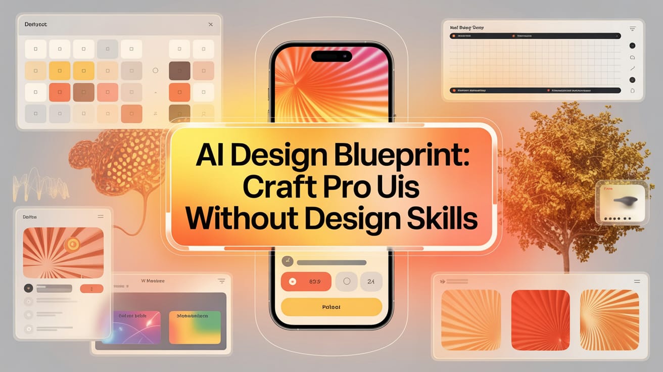
More than a prompt list, this is a complete playbook for devs to systematically build pro-level UIs with AI. Go from raw idea to polished mockup and fast.. Ai Tools.
Table of Contents
Have you ever built an application whose interface looked like a product from a high school computer class? If you’re tired of unattractive interfaces killing your projects before they even launch, you’re in the right place.
In today’s fiercely competitive digital world, design is no longer just a “nice-to-have.” It is a core part of the user experience, the silent language that communicates with your users, determining whether they will trust, engage with, and ultimately love your product. A poor user interface (UI) isn’t just annoying; it’s a financial liability. It increases user churn, lowers customer lifetime value, and destroys the brand credibility you’ve worked so hard to build.

Today, we will explore a revolutionary, detailed system capable of consistently transforming basic ideas into professional-level designs. The best part? It’s completely predictable. No more crossing your fingers and hoping for a miracle when you ask an AI to “make it beautiful.” Instead, we will build a methodical, intentional, and AI-powered process to achieve excellent results every time.
Why Most People Fail With AI-Generated Designs

The biggest mistake people make when asking an AI to build something is giving vague requests like, “Design a beautiful interface.” This is a shortcut to disappointment. An AI, no matter how powerful, cannot read your mind. It doesn’t know what “beautiful” means according to your definition. Beauty is subjective, and without specific direction, the AI will only produce generic, soulless products that are often a jumble of unrelated design elements.
Instead, you need to show the system what you consider beautiful and turn that into a “Visual DNA” – a concrete set of guidelines that makes the design process predictable. This is why poor-quality user interfaces are often the biggest bottleneck for developers who want to build quickly without getting stuck on design.
The Detailed Blueprint That Changes The Game
This system isn’t just a simple two-step process, but a comprehensive 8-step roadmap that takes you from a vague idea to a set of developer-ready mockups.

-
Mine for Visual Inspiration: Stop guessing and start systematically researching professional designs.
-
Create a Style Guide with AI: Use AI to analyze your inspiration and generate a foundational design system.
-
Infuse Psychology into Your Design DNA: Elevate the design system by applying principles of color and typography psychology.
-
Define Your Product Concept (MVP): Clearly articulate your app’s idea.
-
Fuse Your Idea and Design: Tailor the design system to perfectly match your app’s goals and audience.
-
Generate Detailed Mockups (Vibe Design): Guide the AI to create multiple visual design versions for key screens.
-
Ensure Accessibility (A11y): Audit and optimize the design so it can be used by everyone.
-
Go From Static Mockups to User Feedback: Turn designs into a prototype and gather real-world feedback.
Step 1: Mining Visual Inspiration Like A Pro
Most people prompt blindly and hope for a miracle. We’re going to do the opposite. We will build a visual mood board and turn it into a design system that acts as a non-negotiable guide.
Expanding Your Horizons For Inspiration
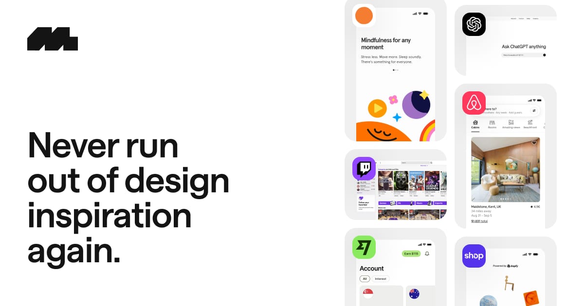
Finding high-quality inspiration is the foundation of the entire process. A great tool for this is Mobbin, which compiles entire UI flows and screens from large B2C consumer mobile and web apps.
However, don’t limit yourself to just one source. Broaden your perspective by exploring other platforms for a more diverse viewpoint:
-
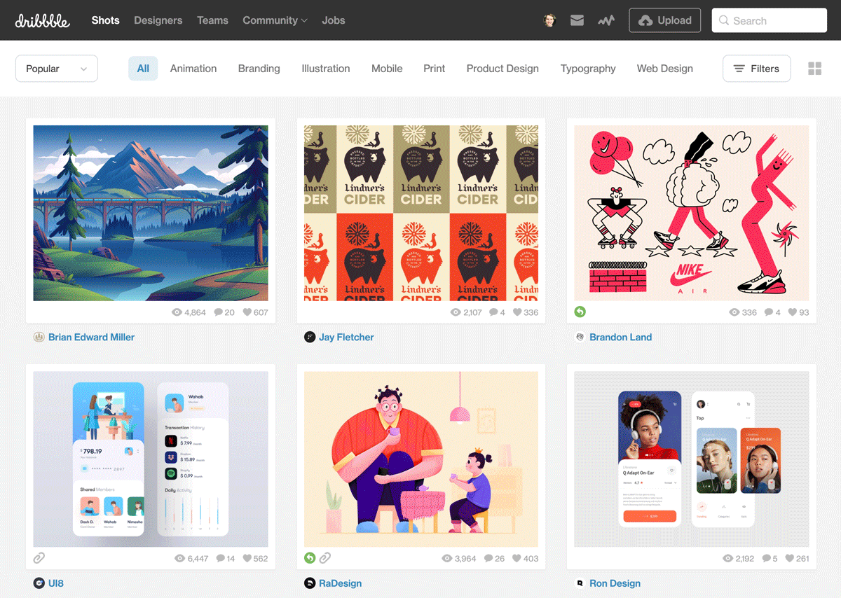
Dribbble: A place where designers showcase small “shots,” often highly conceptual designs, perfect for finding cutting-edge aesthetic trends and unique micro-interactions.
-
Behance: Curated by Adobe, Behance is a showcase for comprehensive design projects, allowing you to see how a design system is applied across multiple screens and touchpoints.

-
Awwwards: Focusing on web design, Awwwards is a treasure trove of creative, unconventional websites, great for drawing inspiration on layout, animation, and visual storytelling.

Pro tip: Seek inspiration from outside your app’s category. If you’re building a finance app, don’t just copy other finance apps. Look at travel, health, or productivity apps with interfaces that appeal to you. This helps you create a unique product instead of a boring imitation.
Learn How to Make AI Work For You!
Transform your AI skills with the AI Fire Academy Premium Plan – FREE for 14 days! Gain instant access to 500+ AI workflows, advanced tutorials, exclusive case studies and unbeatable discounts. No risks, cancel anytime.
Start Your Free Trial Today >>
In-Depth Analysis: A Visual Analysis Checklist
As you browse these sources of inspiration, look beyond the surface. Analyze them with a designer’s eye. Here is a detailed checklist of what to look for:
-
Color Palette:

-
Dominance and Balance: Which color is primary? Which is secondary? What is the ratio between them?
-
Contrast and Attention: How are accent colors used to draw the user’s eye to critical actions (buttons, links)?
-
Psychological Resonance: What feeling does this color palette evoke? (e.g., trust, excitement, peace, luxury).
-
-
Typography System:

-
Readability and Personality: Is this font easy to read? What feeling does it convey (e.g., modern, traditional, friendly, formal)?
-
Information Hierarchy: How have they combined size, weight, and spacing so the user immediately knows what is a main headline, a sub-headline, and body content?
-
-
Layout & Spacing:

-
Information Density: Does the interface feel cluttered or airy? How does this affect the user’s ability to focus?
-
The Power of Whitespace: Whitespace is not wasted space. It is a powerful design tool for creating balance, grouping related elements, and guiding the user’s eye.
-
Grid & Alignment: Is there an invisible grid system being used? The consistent alignment of elements subconsciously creates a sense of order and professionalism.
-
Download Your Reference Screens
Once you find apps you love, download 4-5 key screens that represent the style you want. These images will be the raw material for the next steps.
Step 2: Creating Your Style Guide With AI
Now for the magic part. We’re going to have an AI analyze these screens and create a comprehensive style guide. This is the foundation of your Visual DNA.
The Style Guide Prompt Structure
This is a detailed prompt structure. Don’t just copy and paste; understand why it’s structured this way. It asks the AI not just to output a result, but to “think” like a designer.

You are a Principal Product Designer with years of experience building scalable, user-friendly design systems. Before you give your final answer, I want you to perform a deep philosophical and strategic analysis, enclosed in <thinking_process> tags. In this section, explain your high-level thoughts on the provided images: the perceived purpose of the app, its hypothetical target audience, and the psychological decisions behind their design choices.
After completing that analysis, analyze the attached images and generate a comprehensive design system in the form of design tokens that can be directly used in a web project. This system must include:
1. Color System:
* Primary Colors: Define the main color (e.g., `primary-blue-500`) and its shades (from 100 to 900).
* Secondary/Accent Colors: Identify secondary and accent colors for calls-to-action or highlighting information.
* Functional Colors: Provide hex codes for `success`, `error`, `warning`, and `info` states.
* Neutral/Greyscale Palette: A complete greyscale ramp (from `grey-50` to `grey-900`) for text, backgrounds, and borders.
2. Typography System:
* Font Family: Suggest a font from Google Fonts that matches the overall aesthetic (e.g., `font-sans`, `font-serif`).
* Typographic Scale: Create a responsive typographic scale, defining font size, font weight, and line height for roles like `display`, `h1`, `h2`, `h3`, `body-large`, `body-regular`, `body-small`, `caption`.
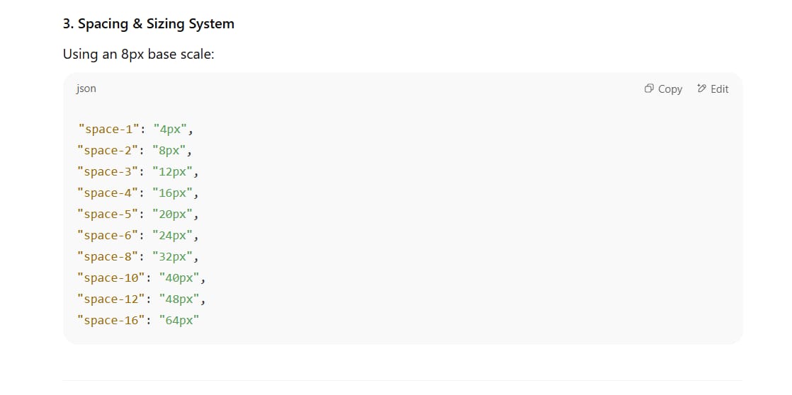
3. Spacing & Sizing System:
* Spacing Scale: Create a spacing scale based on a 4px or 8px base unit (e.g., `space-1` = 4px, `space-2` = 8px, ... `space-16` = 64px) for margin, padding, and gaps.
4. Component Styling Principles:
* Border Radius: Define corner radius values (e.g., `rounded-sm`, `rounded-md`, `rounded-lg`, `rounded-full`).
* Shadows: Provide a range of shadow effects (e.g., `shadow-sm`, `shadow-md`, `shadow-lg`) to create depth.
5. Overall Design Philosophy:
* Summarize the overall user experience (UX) approach and design philosophy that this system embodies.
[Attach the images you downloaded here]


Step 3: Infusing Psychology Into Your Design DNA
This is an advanced step that many people skip, yet it’s the key to creating a design that is not only beautiful but also effective. A design system is just a set of rules; psychology turns those rules into an intentional conversation with the user.
-
Color Psychology: Colors aren’t just for aesthetics; they evoke emotion.

-
Blue: Often associated with trust, security, and professionalism. It’s why so many banks and tech companies use it.
-
Green: Evokes feelings of nature, growth, health, and peace. Ideal for apps related to wellness, the environment, or finance (money).
-
Red: The color of urgency, passion, and importance. Often used for error messages, “delete” buttons, or urgent promotions.
-
Yellow/Orange: Evokes optimism, energy, and attention. Great for calls-to-action you want users to notice without the alarm of red.
-
Dark Tones: Often convey luxury, sophistication, and focus. Perfect for entertainment apps or creative tools where the content needs to stand out.
-
-
Typography Psychology: Your typeface is the voice of your brand.

-
Serif (e.g., Times New Roman): Conveys tradition, authority, and trustworthiness. Often used by established institutions like newspapers or universities.
-
Sans-serif (e.g., Arial, Helvetica, Roboto): Conveys modernity, cleanliness, and approachability. The dominant choice for digital apps and startups.
-
Script (handwriting): Conveys elegance, creativity, and a personal touch.
-
Font Weight: Bold text grabs attention and signifies importance. A light weight can feel delicate and high-end.
-
By understanding these principles, you can begin to consciously tailor your design system to evoke the desired emotions and behaviors from your users.
Step 4: Defining Your Product Concept (MVP)
Now we need to take your app idea and define it clearly.
The MVP Prompt Structure
Create a new chat and use this framework. Be as specific as possible.
I want to create an app that [describe your core idea and unique value proposition].

The basic MVP (Minimum Viable Product) should allow users to [describe the core functionality and main user flow].

**Product Details:**
* **Primary Audience:** [Who is this for? Describe their demographics, needs, and pain points.]
* **Key Problem It Solves:** [What specific pain point does this app address?]
* **Unique Selling Point (USP):** [What makes this app different from its competitors?]
* **Core Features Needed:** [List 3-5 essential features for the first version.]
Example: The “UrbanGarden Connect” App
Let’s see this in action with a real example. Suppose we want to create an app that connects city gardeners.

Core Idea: A social mobile app for urban gardeners to build community, share knowledge, and exchange resources.
Basic MVP: Users sign up, create a profile for their garden (balcony, rooftop, etc.), post updates and photos, join topic-based discussion groups (e.g., “Rooftop Tomato Growing”), and find other gardeners nearby.
Primary Audience: Young urban dwellers (25-45) living in apartments, interested in sustainability, organic food, and connecting with nature and their community.
Key Problem: The isolation of gardening in small spaces; lack of knowledge and support specific to urban conditions.
USP: A hyper-local focus and community building, combining social elements with the sharing of tangible resources (seeds, tools).


Step 5: Fusing Your Idea And Design
Now we take the style guide and our psychological insights, then fuse them with your specific app concept.
The Fusion Prompt

Now, act as a Creative Director. Fuse your previous <thinking_process> analysis with the app idea below and the principles of design psychology.

Enclose your new reflections on how to adapt the design system for this specific app in <pontificating> tags. Explain how you will use color, typography, and space to support the goals of the "UrbanGarden Connect" app. For example, why would you choose that specific shade of green? Which sans-serif font would be most appropriate and why?

After you're done, output an **updated Design System** based on the app's requirements below, adjusting colors, typography, and philosophy accordingly.

[Paste your MVP description here]
This fusion process creates a design system that is specifically tailored for your app, ensuring every visual element reinforces the product’s core purpose.


Step 6: Generating Detailed Mockups (Vibe Design)
This is where the magic really happens. We’re going to create multiple screens for our app, but with a crucial twist – we’re going to focus the AI entirely on design rather than functionality.
The Detailed Design Prompt Template

**GOAL:** This is a UI design exercise. Create beautiful, detailed, high-fidelity mockups.

**GUIDELINES:**
-   Use the [Lucide](https://lucide.dev/icons/) library for all icons to ensure consistency.
-   Style with [Tailwind CSS](https://tailwindcss.com/) utility classes.
-   Simulate iPhone frames for mobile mockups.
-   Focus on visual design, not functional code.
-   Remember: THIS IS A DESIGN EXERCISE.

**DESIGN SYSTEM:**
[Paste your complete fused design system here]

**APP OVERVIEW:**
[Paste your MVP description here]

**TASK:**
Follow the guidelines above and create mockup screens. For each screen, brainstorm and propose **THREE different unique solutions**. Each approach should be unique but still conform to the overall UX/UI parameters.

First, design the individual components, then assemble them into the complete screens.

**COMPONENTS TO DESIGN:**
1.  **Post Card:** A card to display a feed post, including a photo, user avatar, name, text, and interaction buttons (like, comment).
2.  **Bottom Navigation Bar:** Contains icons for navigating to the Feed, Discover, Add New Post, and Profile.

**SCREENS TO CREATE (using the components above):**
1.  **Onboarding Screen:** A screen to welcome new users and gather initial information about their garden (type, experience level).
2.  **Community Feed:** The main screen where users see posts from other gardeners.
3.  **User Profile Screen:** Displays a user's garden, their posts, and achievements.

Output each component and screen as a separate file for easy editing later.

Step 7: Ensuring Accessibility (A11y)
A beautiful design is useless if a portion of your users can’t use it. Accessibility is not an add-on feature; it is a fundamental requirement of good, responsible design. It’s not only the right thing to do ethically, but it also expands your potential market and, in many cases, is a legal requirement (WCAG compliance).
We can guide our AI to prioritize accessibility.
The Accessibility Optimization Prompt

After the AI has generated the mockups, use a follow-up prompt like this:
Excellent. Now, act as a Digital Accessibility Specialist. Review the designs you just created and their design system.
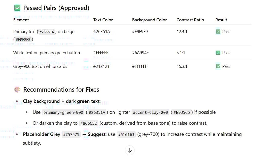
Perform the following tasks:
1. **Check Color Contrast:** For every text and background color pair used, verify that they meet a minimum contrast ratio of 4.5:1 (WCAG AA standard). If any pair fails, suggest an alternative color from our color system that passes while maintaining the overall aesthetic.
2. **Suggest ARIA Labels:** For all non-text interactive elements (e.g., icon-only buttons), suggest descriptive `aria-label` attributes that clearly state their function. For example, a button with a gear icon should have `aria-label="Settings"`.
3. **Image Alt Text:** For the images in the mockups (like avatars, post photos), provide examples of good, descriptive alt text. For example: `alt="A cherry tomato plant brimming with ripe red fruit on a sunny balcony."`
Present your findings as an accessibility audit report.


Step 8: From Static Mockups To User Feedback
Beautiful mockups are a great start, but they are only assumptions. To validate your design decisions, you need to turn them into something real users can interact with and give feedback on.
Turning Designs into a Prototype
-
Import Assets: Take the AI-generated mockups and import them into a professional design tool like Figma, Adobe XD, or Penpot (an open-source option).

-
Link the Screens: Use the tool’s prototyping features to create “hotspots.” For example, when a user clicks the “Profile” button in the navigation bar, it links to the User Profile screen.

-
Create a User Flow: Link enough screens together to create a testable primary user flow, for instance, from opening the app, to scrolling the feed, to clicking on a profile.
Using AI As A UX Research Assistant

Now that you have a clickable prototype, you can use AI to help you create the tools to gather feedback.
You are a User Experience (UX) Researcher. Based on the "UrbanGarden Connect" app concept and the screens we've created, help me prepare for user testing.

1.  **Create a User Interview Script:** Write a short script to walk a potential user through the prototype. It should include a greeting, opening questions, a few tasks for the user to perform (e.g., "Try to find a post about growing basil"), and wrap-up questions.
2.  **Create a Survey Questionnaire:** Design a 5-question survey using a Likert scale (from 1-Strongly Disagree to 5-Strongly Agree) to gauge user sentiment on the design's clarity, trustworthiness, and aesthetic appeal.
By taking this step, you are moving from “I think this looks good” to “data shows that users understand and enjoy this design.”


Conclusion: Become The Creative Director For Your AI
The biggest takeaway from this entire process is simple: Stop asking language models to be vague creative geniuses. Instead, take on the role of a Creative Director. Your job is to provide them with professional inspiration, a clear strategy (the Visual DNA), and meaningful constraints (psychology, accessibility).
When you do this, you get pro-level results every single time. Professional designers will never become obsolete; their role is evolving. They will be the ones who provide the inspiration, strategy, and creative direction that AIs need to execute. This system just helps developers and entrepreneurs execute that vision effectively.
Now, with a powerful process in hand, you can confidently build products that not only work well but also feel great to use. You can focus your energy on solving real problems for real people, knowing your design will support, not hinder, your success.
If you are interested in other topics and how AI is transforming different aspects of our lives or even in making money using AI with more detailed, step-by-step guidance, you can find our other articles here:
-
Transform Your Product Photos with AI Marketing for Under $1!*
-
Build Killer App Designs with AI (No Design Skills Needed!)
*indicates a premium content, if any
Leave a Reply