
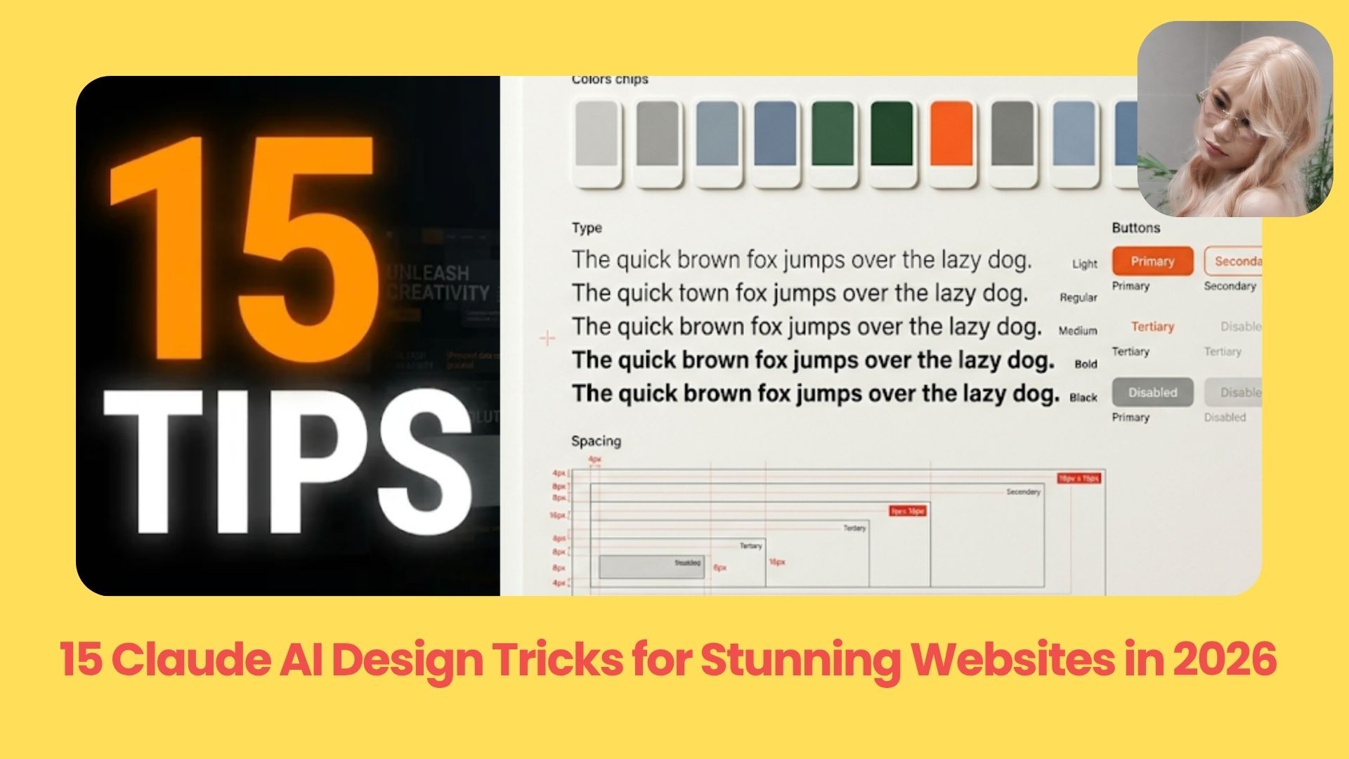
Turn generic Claude designs into professional-looking websites with 15 practical tricks for better layouts, consistent branding, smooth animations, and polished visuals.. Ai Fire 101, 🔥 Ai Fire Academy.
TL;DR: Better Claude AI design starts with clear references, consistent brand rules, and testing different layouts. These 15 tips help you turn generic AI designs into more professional, distinctive websites.
Start by showing Claude specific design examples and telling it exactly what to borrow. Build a reference library and design system to keep your brand consistent across projects.
Next, explore six homepage directions before choosing one. Use tweaks to test small changes, improve your copy, and run a design critique to catch visual and usability issues.
15 practical tips: From design inspiration to a working product.
Common mistake: Accepting Claude’s first decent-looking design.
Best approach: Compare different directions before polishing details.
Table of Contents
Introduction
Claude can build a good-looking website in minutes. But most Claude AI design projects end up looking almost identical.
Claude plays it safe with familiar layouts, predictable colors, and design styles that look decent but rarely stand out. And if you’re trying to build something professional, that’s frustrating.
In this guide, I’ll walk you through 15 practical ways to make your Claude designs look more professional and unique.
Quick note: Anthropic is moving design features into Claude Artifacts alongside the standalone experience. These tips apply to both, although the interfaces may look a little different.
Part 1: Feed Claude Better References
One of the easiest ways to improve your Claude AI design results is to show Claude exactly what you like before it starts building.
Tip 1: Give Claude Specific Design References
Claude tends to choose safe, familiar layouts when you give it a vague prompt. A few good references can make a huge difference.
You can use screenshots, websites, or even individual elements from different designs.
For example, upload two screenshots and give Claude this prompt:
Use the navbar from screenshot 1, the typography from screenshot 2, and the card fade-in animation from [website URL]. Combine them into one consistent design for my website.
Where can you find good references?
-
Visual inspiration: Browse website galleries, font collections, icon libraries, and individual UI sections like navbars or footers.
-
Motion inspiration: Look for hover effects, scroll animations, and interactive elements you’d like to recreate.
The key: Tell Claude which specific details to borrow from each reference. This gives you much more control over the final result.
Tip 2: Let Claude Find the Best References for You
Some design galleries have thousands of examples. Going through them manually can take forever. So just ask Claude to do the searching.
Let’s say you’re building a website for Future Fuel, a fictional AI energy drink brand. Try this prompt:
Browse [design gallery URL] and find the 3 best design references for Future Fuel, an AI-powered energy drink brand. Share the links, explain why each fits, and suggest which design elements I should use.
Claude can review accessible gallery pages and suggest relevant examples for you to compare.
You can repeat this process with app-screen galleries like Mobbin or other design collections.
→ My tip: Start with 3 strong references. It’ll be much easier to identify a clear direction before you build anything.
Tip 3: Build Your Own Design Reference Library
Once you start collecting good designs, screenshots and bookmarks can get messy pretty quickly.
I recommend creating a personal design inspiration library that you can reuse across projects.
You can ask Claude to build one for you:
Create a design reference library where I can save screenshots, website links, and design ideas. Organize everything by category, including typography, navigation, animations, and layouts. Add tags, notes, and a search feature so I can quickly find references later.
You have two options:
-
Claude Artifacts: Build an interactive library directly inside Claude. This is the quickest way to get started.
-
Claude Code: Build a local version that saves your reference collection on your computer.
And save interesting designs even when they don’t fit your current project.
Over time, you’ll have your own collection of references ready whenever you start a new Claude AI design project.
Part 2: Lock In Your Brand with Design Systems
Tip 4: Create a Design System
Ever notice how Claude gives you different colors, fonts, or button styles every time you create something, even for the same brand?
That’s what happens when you build without a design system.
A design system is basically your brand’s rulebook. It tells Claude exactly how everything should look and work. It usually covers:
-
Colors and typography: Your brand colors, font styles, and text sizes.
-
Layouts and components: Spacing, buttons, cards, navigation, and rules for using them.
The good news? You can create one from assets you already have.
Upload your website screenshots, logo, existing designs, or font files, then try this prompt:
Analyze these brand assets and create a complete design system. Define the color palette, typography, spacing, buttons, and reusable components. Include clear usage rules so I can apply this system consistently across future projects.
Once Claude creates your design system, you can reuse it across different projects.
→ The benefit: Your website, landing pages, and slide decks can all share the same visual identity, making your Claude AI design projects look much more professional.
Tip 5: Mix and Match Different Design Systems
Here, we combine multiple design systems to create a unique style. For example, maybe you love Apple’s clean typography but prefer Spotify’s bold colors and energetic feel.
You can ask Claude to study both styles and combine specific elements with your own brand identity. Try this:
Create a design system for my brand using Apple's minimalist typography and spacing, Spotify's bold color approach, and my existing brand logo and colors. Keep my brand identity recognizable while combining these influences into a consistent visual style.
You can also ask Claude to create design systems from brands you admire first, then mix them with your existing one.
My tip: Be specific about what to borrow from each brand. That gives Claude clearer direction and helps you create something distinctive without simply copying another company’s design.
Part 3: Explore Before You Commit
Tip 6: Generate Multiple Design Directions First
Most people accept the first decent-looking design Claude generates. But you could be missing a much better option.
Before building a full website, I recommend asking Claude to explore 6 completely different design directions.
Here’s the prompt:
Create 6 meaningfully different homepage designs for my brand. Explore different layouts, typography, colors, and visual styles. Show them side by side so I can compare and choose the best direction before building the full website.
Once you see all six, pick your favorite or combine elements from different versions.
For example, you might love the hero section from Design 2 but prefer the typography and navigation from Design 5.
→ The benefit: You can explore more creative possibilities without spending hours rebuilding your website from scratch.
Tip 7: Use Tweaks to Fine-Tune Your Design
Sometimes, changing one small detail can completely change how your website feels. That’s where Tweaks come in.
You can ask Claude to add interactive controls that let you switch between design options directly in your preview. Try this prompt:
Add interactive design tweaks throughout my website. Let me switch between different typography styles, button designs, hero layouts, and accent colors. Include a control panel so I can compare options and apply my final choices.
Instead of writing a new prompt for every little adjustment, you can test combinations in seconds. For example:
-
Typography and buttons: Try different font weights, text sizes, button shapes, and hover styles.
-
Hero and colors: Switch between centered and split layouts, or test different accent colors.
Once you’re happy, ask Claude to apply your selected options and remove the tweak controls.
This is one of the fastest ways to polish your Claude AI design without endless back-and-forth prompting.
Tip 8: Add Micro-Interactions That Make Your Design Feel Premium
A website can look amazing in a screenshot but feel surprisingly basic when you start clicking around.
Usually, that’s because the interface barely responds to user actions.
Micro-interactions are small animations that happen when someone hovers over a button, clicks an element, types into a field, or waits for something to load.
Here’s a prompt to try:
Add subtle micro-interactions throughout my website, including button hover effects, scroll-triggered reveals, smooth section transitions, and gentle parallax. Give me multiple animation options using tweaks so I can compare them. Keep the overall experience smooth and professional.
You can experiment with two types of motion:
-
Subtle interactions: Button feedback, card hover effects, and smooth content reveals.
-
Signature interaction: One memorable animation, such as a hero visual that responds to scrolling.
My tip: Keep most animations subtle and save one standout effect for the most important section. Too much movement can make your website distracting, so focus on interactions that actually improve the user experience.
Part 4: Polish the Content and Quality
Tip 9: Remove AI-Sounding Copy
Even a beautiful website can feel generic when the headline says something like “Revolutionize Your Workflow.”
Claude often generates these vague marketing phrases, so I recommend giving it a brand voice guide before writing your website copy.
Here’s an easy way to create one:
Study the homepages of 5 successful energy drink brands. Analyze how they write headlines, buttons, and product descriptions. Create a tone-of-voice guide for AI Fire Future Fuel, then rewrite my website copy to match that style while keeping it original.Already have a brand voice guide? Upload it and ask Claude to follow your existing tone, phrases, and writing style.
 |

pretty cool, huh? |
My tip: Once you’re happy with the results, ask Claude to turn your voice guide into a reusable brand voice skill.
This helps keep your copy consistent across future Claude AI design projects.
Tip 10: Run a Design Critique with Impeccable
After making several design changes, you’ll probably have small issues you haven’t noticed. That’s where Impeccable comes in.

It’s a free design skill package with commands that help improve typography, layouts, animations, and overall visual quality.
One of the most useful commands is /critique. It reviews your design from two perspectives:
-
Visual quality: Typography, spacing, colors, hierarchy, and consistency.
-
User experience: Navigation, usability, clarity, and how people interact with your website.

Once installed in a supported environment, run: /critique

Impeccable will identify potential problems and suggest specific improvements.

→ My tip: Run a critique after you’ve finished your main design. It’s an easy way to catch issues before publishing.
Part 5: Upgrade Your Visual Assets
Tip 11: Use Real or AI-Generated Images
One of the fastest ways to improve your Claude AI design is to replace generic placeholder images with better visuals.
Ideally, give Claude your hero image or product photo before building anything. That way, it can design the layout around your actual assets.
You have two options:
-
Use your own images: Upload product photos, branded graphics, or existing marketing assets.
-
Generate new images: Connect an image generator like Higgsfield, then ask Claude to create visuals that match your website.
For example:
Generate a premium product hero image for Future Fuel, featuring a futuristic energy drink can with dramatic lighting. Match my brand colors and use the image in the homepage hero section.
With a compatible image-generation integration, Claude can help generate and place the assets directly into your design.
Tip 12: Add Motion with Video
Want your website to feel more premium? Try adding a little video. Two effects worth exploring:
-
Seamless video loops: Short background videos that repeat smoothly in hero sections, ads, or presentations.
-
Scroll-controlled videos: Videos that move forward as users scroll down and backward when they scroll up.
Here’s a simple prompt:
Add a seamless looping background video to my hero section. Keep the text readable, make the video responsive, and ensure the animation feels smooth.
For product showcases or storytelling websites, scroll-controlled videos can create an impressive experience.
Just be careful: Heavy animations can slow down your website or distract visitors. Use them where they actually improve the experience.
Tip 13: Use Professional Component Libraries
Claude can build components from scratch, but you can often get better results faster by using code created by professional designers.
Here are five libraries worth exploring:
|
Library |
Best For |
|---|---|
|
Navbars, cards, pricing sections |
|
|
Animated text, interactive backgrounds |
|
|
Experimental effects like liquid glass and particle reveals |
|
|
Smooth UI transitions |
|
|
Advanced animations and scroll effects |
Unlike inspiration galleries, these libraries provide actual component code you can use.
Find something you like, copy the component code or share its link with Claude, then try:
Add this component to my website: [component URL or code]. Adapt its colors, typography, and spacing to match my existing design system. Keep the animation smooth and responsive.You can also ask Claude to browse accessible component libraries and recommend effects that fit your brand.
This can save hours of manual work while making your Claude AI design look more polished.
Tip 14: Use One Consistent Icon Pack
Mixing different icon styles can make an otherwise beautiful website feel messy.
For example, combining thick outlined icons with colorful 3D illustrations creates an inconsistent look.
My recommendation: Pick one icon style and use it throughout your entire project.
You can explore Iconify or Icons8 for ready-made icon collections.
Then give Claude this prompt:
Use a consistent icon style across my website. Keep the stroke width, size, and visual weight uniform. Replace any mismatched icons and make sure they fit my brand's design system.For custom icons, you can also use an image generator to explore different styles and create a matching collection.
One useful trick: Ask Claude to use SVG icons whenever possible. They stay sharp at any size and are easy to recolor or animate. And if you want animated icons without building everything yourself, check out Lordicon.
→ Keeping your icons consistent is a small change, but it can make your entire design feel much more professional.
Tip 15: Hand Off Your Design to Claude Code
Once you’re happy with your design, you might want to turn it into a fully working product.
Claude Design is great for exploring layouts, visuals, and interactions. But if you’re building an app with user logins, databases, or payments, you’ll need a proper development environment.
That’s where Claude Code comes in. You have two ways to connect them:
-
Option 1: Design first, code later. Build and polish your interface in Claude Design, then hand it over to Claude Code to implement the actual functionality.
-
Option 2: Start in Claude Code. Use the
/designcommand in supported setups to bring design capabilities directly into your coding workflow.
My recommendation: Start with Claude Design to get the look and feel right, then move to Claude Code when you’re ready to build the real product.
Conclusion
Getting better Claude AI design results comes down to two things: giving Claude clearer direction, and spending more time in the exploration phase before you polish.
Here’s what I’d actually start with:
-
Find 3 strong design references before you prompt anything
-
Build a simple design system from your existing brand assets
-
Generate 6 directions and pick the best one before building the full site
You don’t have to apply all 15 tips at once. Even two or three of them will make a noticeable difference on your next project.
If you are interested in other topics and how AI is transforming different aspects of our lives or even in making money using AI with more detailed, step-by-step guidance, you can find our other articles here:
-
Get the MOST Out of ChatGPT Images 2.6: Make GIFs, Edit Like a Pro & All New Features!
-
Gemini Notebook’s HUGE 2026 Upgrade: Talk, Research & Learn from Anywhere!
-
Clone Your Own Voice for FREE Anytime with Claude + This AI Tool (Step-by-Step Guide)*
-
Stop Watching Tutorials! These 3 Claude Workflows 10x Productivity (All Prompts Included)*
-
I Ranked All the Hottest AI Business Ideas from Worst to Best (Ranked Tier C to S)*
*indicates a premium content, if any
Leave a Reply