
Learn the ‘DIG’ framework, a simple way to get accurate data analysis from AI. We show you how to avoid mistakes and make AI work like a smart assistant.. Ai Tools, Prompt Engineering.
Table of Contents
Do you want to make your data analysis work faster and smarter? You are in the right place. Whether you work with numbers every day or just need to understand spreadsheets sometimes, this article will show you how to use AI tools to get better results.
By the end of this article, you will know when to use AI for data work, how to avoid common mistakes, and practical ways to turn boring spreadsheets into useful information.
Why Is AI Important For Data Analysis?

Let’s be honest, old-style data analysis takes a lot of time. You spend hours cleaning data, making charts, and checking for mistakes. AI changes that.
But here is an important thing: you cannot just “throw” data at AI and hope for a good result. You need to know the right way to do it.
The good news? You don’t need to be a programmer or a data scientist. You just need to understand a few main ideas and follow a proven process. AI is like a very smart, very fast assistant, but it needs clear instructions from you.
When Should You Really Use AI? The ACHIEVE Framework
Before you start with AI tools, let’s talk about when it makes sense to use them. There is a helpful acronym called ACHIEVE that covers five situations where AI is really helpful.
A – Aiding Human Coordination
People are messy when we work together. We misunderstand each other all the time. AI can help clean up that mess.
Real example: You just finished a team meeting. Instead of trying to remember everything, you can upload the meeting recording (transcript) to AI.
Example Prompt (Detailed):

"I uploaded a 30-minute meeting recording of my team. Please read it and:
Summarize the main decisions we made.
List the action items we need to do.
Say who is responsible for each action and what the deadline is."
Why this is useful: It makes things clear for everyone. No one can say, “I don’t remember us deciding that.”
Another example: Imagine you are planning a company event and get emails from many different suppliers (food, sound, location).
Example Prompt (Detailed):

"Here are 5 emails from 5 different suppliers. Please read them all and make a simple comparison table. I need these columns: Supplier Name, Service They Offer, Price, and Date They Are Available."
C – Cutting Out Tedious Tasks
Nobody likes doing boring, repetitive work. This is exactly what AI is great at.
Real example: Let’s say you are holding a workshop and 50 people signed up. They filled out a form with their name, department, interests, and experience level. Instead of checking each answer by hand…
Example Prompt (Detailed):
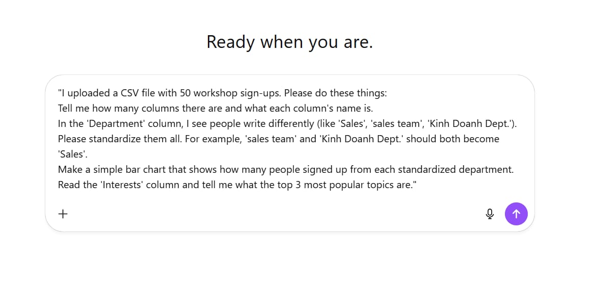
"I uploaded a CSV file with 50 workshop sign-ups. Please do these things:
Tell me how many columns there are and what each column's name is.
In the 'Department' column, I see people write differently (like 'Sales', 'sales team', 'Kinh Doanh Dept.'). Please standardize them all. For example, 'sales team' and 'Kinh Doanh Dept.' should both become 'Sales'.
Make a simple bar chart that shows how many people signed up from each standardized department.
Read the 'Interests' column and tell me what the top 3 most popular topics are."

Why this is useful: This kind of data cleaning used to take hours. Now it takes minutes.
Learn How to Make AI Work For You!
Transform your AI skills with the AI Fire Academy Premium Plan – FREE for 14 days! Gain instant access to 500+ AI workflows, advanced tutorials, exclusive case studies and unbeatable discounts. No risks, cancel anytime.
Start Your Free Trial Today >>
H – Help Provide A Safety Net
Does AI make mistakes? Yes. But guess what? People do, too. We make mistakes all the time.
We all can make silly errors, especially with detailed work.
Real example: Let’s say you are submitting an expense report for work. You need to follow company policy, but those policies can be long and confusing. You can upload both your expense receipt and the company policy to AI.
Example Prompt (Detailed):

"I uploaded 2 files. File 1 is 'policy.pdf' (my company's spending policy). File 2 is 'receipt.jpg' (my dinner receipt).

The policy says dinner must be under $50 per person and cannot include alcohol.

My receipt is for 3 people for a total of $160, and it includes one bottle of wine.

Please check and tell me: Does my receipt break any rules in the policy? If yes, please explain clearly what it breaks."
Why this is useful: It acts like a second checker before you send something important. It helps you avoid silly mistakes.
I – Inspire Better Creativity
People think AI kills creativity. That is backward. AI can actually push you to think better.
Real example: You have made an important presentation. Before you give it, upload the slides to AI and ask it to act like a skeptical person (a person who doubts or questions things).
Example Prompt (Detailed):

"Imagine you are a very tough investor. I uploaded my 10-slide pitch deck.
Please read it and:
Find the 3 biggest weaknesses in my business plan.
Write 10 hard questions you would ask me in the meeting.
Don't praise me. Focus on the risks."
The Result:

10 Hard Questions

1. What is your current burn rate and how many months of runway do you have?
2. How much revenue have you generated so far — and from how many paying customers?
3. What’s the single metric that proves your model works at scale?
4. What stops a larger, better-funded company from doing exactly what you’re doing?
5. Why are you raising this specific amount — how did you calculate it?
6. What’s your CAC (customer acquisition cost) and LTV (lifetime value)?
7. How do you plan to reduce CAC as you scale?
8. If your main growth channel disappears tomorrow, what’s your backup?
9. What’s your exit plan if you can’t hit product-market fit in the next 12 months?
10. Which assumption in your financial model worries you the most — and what’s your plan if it fails?
Why this is useful: This forces you to prepare better. It helps you see blind spots you missed. Humans are creatures of habit. AI can break those patterns and show us new angles.
E – Enable Great Ideas To Scale Faster
Remember the workshop example? This is where it gets really cool.
After analyzing the sign-up data, you want to make a custom “cheat sheet” for each person based on their specific interests and skill level. Before, this was impossible if you had more than 10 people.
Example Prompt (Detailed):

"Let's use the workshop sign-up file from before.
Look at the 'Experience Level' column (e.g., 'Beginner', 'Intermediate') and the 'Interests' column (e.g., 'Writing', 'Design').
My goal: Write a personal email to each person.
The email should start with 'Hi [Name],'
Then, based on their interest, suggest 1 specific tip. For example: If they like 'Writing', give them a tip on writing good headlines. If they like 'Design', give them a tip on matching colors.
Please make a table for me with two columns: 'Attendee Email' and 'Personalized Email Body'."
The Result:
|
Attendee Email |
Personalized Email Body |
|---|---|
|
emma.writes@email.com |
Hi Emma, Since you’re interested in Writing, here’s a quick tip: focus on crafting headlines that promise a clear benefit or emotion. For example, “How to Write Emails People Actually Reply To” works better than “Email Writing Tips.” |
|
alex.designs@email.com |
Hi Alex, I saw you’re into Design – one quick tip: use the 60-30-10 color rule. Pick one dominant color (60%), one secondary (30%), and one accent (10%) for clean, balanced visuals. |
|
mia.codes@email.com |
Hi Mia, Because you’re passionate about Coding, try explaining your code to a non-technical friend. If they can follow your logic, your structure is probably clear and maintainable. |
|
daniel.marketing@email.com |
Hi Daniel, As someone interested in Marketing, remember this: always lead with the customer’s pain point, not your product. Your copy should sound like it came from their own thoughts. |
|
lily.photography@email.com |
Hi Lily, For Photography, try shooting during “golden hour” – the hour after sunrise or before sunset. It gives natural light that makes any subject instantly more cinematic. |
Why this is useful: This kind of personalization used to be impossible on a large scale. Now you can make 50 or 500 people feel special.
The DIG Framework: Your Analysis Process
Okay, so you know when to use AI. Now let’s talk about how to do analysis the right way. There is a simple framework called DIG that will save you from bad results and wrong answers.

DIG stands for: Describe, Introspect, Goal-set.
If you have any background in data work, this is basically exploratory data analysis (EDA), but it is designed specifically for working with AI.
Step 1: Describe Your Data
This is the most important step. Do not skip it.
When you upload data to AI – let’s say a spreadsheet – do not immediately ask for fancy analysis. First, make sure you and the AI actually understand what you are looking at.
Start by asking:

"I just uploaded an Excel file named 'Customer_Feedback_Q1.xlsx'.
Please list all the column names in this file.
For each column, tell me the data type (e.g., text, number, date).
Show me the first 3 rows of the data so I can see a sample."
Let’s say you uploaded customer survey data. The AI might show you columns like:

-
CustomerID
-
Survey Date
-
Rating (1-5)
-
Comments (text)
-
Support Agent
Here is the critical part: Look carefully at the sample data. You might notice “NaN” (not available) or blank cells. This is important because missing data causes mistakes and wrong answers later.
When you see problems, you need to find out:
-
Is the data really missing?
-
Or is the AI just reading the file wrong?
If it’s a reading problem, correct the AI immediately. If data is really missing, make a note – you will need to remember this for later analysis.
Next, ask for more samples:

"Thank you. Now, let's look closer at the 'Rating (1-5)' column.
Are the values in this column only the numbers 1, 2, 3, 4, and 5?
Or is there any text (like 'five stars') or strange numbers (like '99')?
Tell me the lowest and highest value you found in this column."
Then ask:

"What do you think each of these columns means? Please explain in simple language."The result:
|
Column |
Meaning |
|---|---|
|
CustomerID |
A unique number given to each customer so we can tell them apart. |
|
Survey Date |
The date when the customer filled out the feedback form. |
|
Rating (1–5) |
How satisfied the customer was, using a 1–5 scale (1 = very unhappy, 5 = very happy). |
|
Comments |
The customer’s written feedback — what they liked or disliked. |
|
Support Agent |
The name of the staff member who helped that customer. |
-
“CustomerID seems to be a unique number for each customer.”
-
“Rating (1-5) is probably the customer’s satisfaction score, with 5 being the best.”
-
“Comments is the opinion the customer wrote.”
This step helps both you and the AI get on the same page. Think of your AI as a smart, junior analyst. You need to make sure they understand the data before doing any real work.
Step 2: Introspect The Data
Now that the AI understands what it is looking at, it’s time to think about patterns and relationships.
Ask:

"With this customer survey dataset, please tell me 5 interesting questions we could answer and why they are interesting."The AI might suggest:

-
“Is there a connection between ‘Support Agent’ and ‘Rating (1-5)’? This is interesting because we can see if some support staff are doing better than others.”
-
“What are the most common words in the ‘Comments’ column when the ‘Rating’ is 1 or 2? This is interesting because it helps us find the main reasons why customers are unhappy.”
But look out for “red flags” (warning signs). If the AI suggests, “What are the sales in each country?” and you know your data has no country information, that is a problem.
When you spot this, correct it immediately:

"The question about countries is good, but this dataset does not have country information. All of these customers are in Vietnam.

Please generate 5 more questions that we can answer using only the columns I gave you (CustomerID, Survey Date, Rating, Comments, Support Agent)."
This back-and-forth is very important. It prevents bad analysis later. Plus, AI sometimes suggests interesting angles you would not have thought of.
I know this feels slow. You want to jump straight to making graphs and charts. But trust me – if you mess up at this stage, every analysis after this will be wrong. Even when working as a data scientist, a lot of time is spent on this step. It’s not an AI problem – it’s a data problem. Skip this and you risk making expensive mistakes.
Step 3: Set Clear Goals
AI needs to know what you are trying to do. If you just say “analyze this data,” it will not know what to do.
Be specific. For example:

"My goal is to find out why our satisfaction score went down this month.

I want you to focus on the negative comments (ratings 1 and 2).

Please find the 3 most common complaint topics.

Finally, I need 3 simple bullet points and 1 pie chart that I can put in a PowerPoint presentation for my boss. The presentation must be very clear and professional."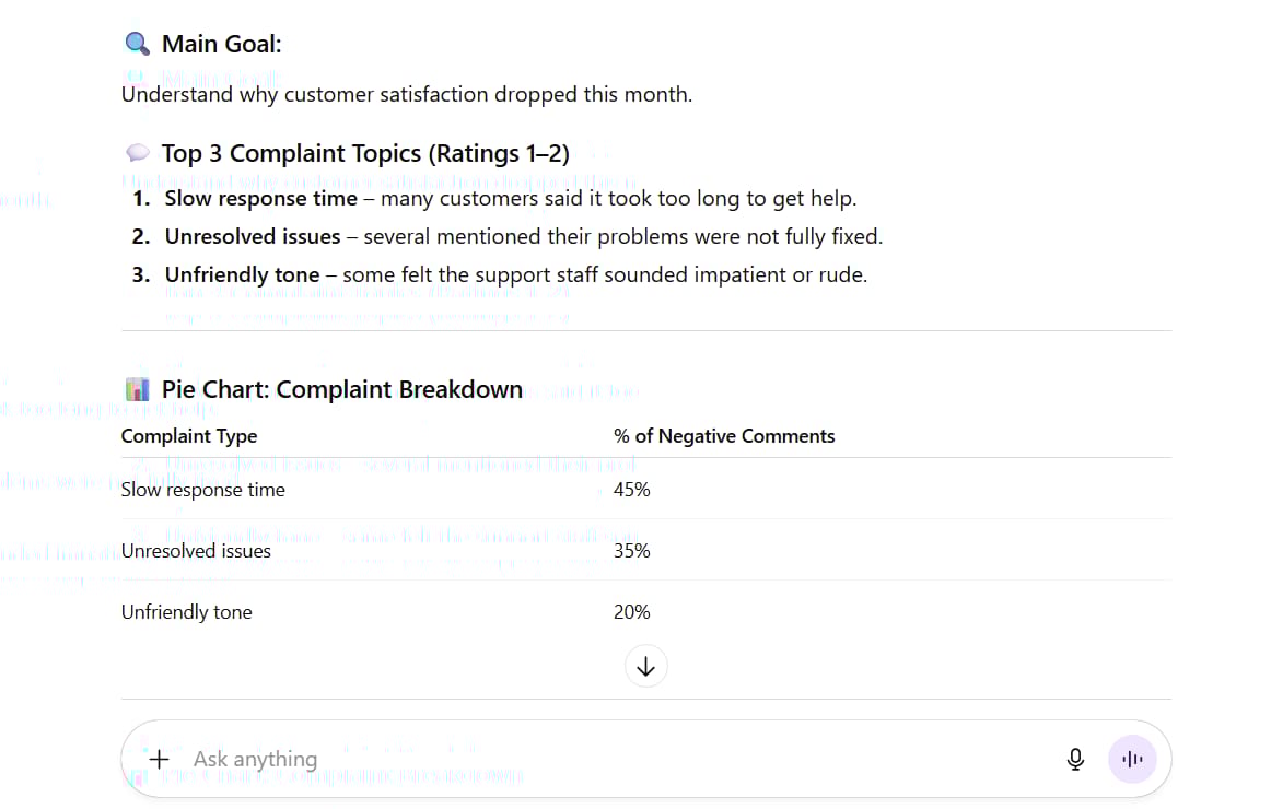
This context helps the AI adjust everything – the analysis method, the presentation style, even the tone.
If you were making a serious report for your boss, the AI would approach it completely differently than if you said, “Just find some fun facts for me to post on Twitter.”
This is basic prompt engineering: be clear about your final goal.
Going Beyond Basic Spreadsheets
Everything we have talked about so far can be used for traditional data analysis—the kind you might do with Excel, Python, or SQL. AI just makes it more convenient through conversation.
But AI opens up analysis that would be extremely difficult the old way.
Smart Filtering With AI
Here is an example: Let’s say you are job hunting with that salary dataset. You want to find:
-
Jobs paying $50,000 to $80,000
-
Located on the East Coast
-
Jobs that involve working with wood
Here is the problem: The dataset does not have a “works with wood” column. It also does not say “East Coast vs. West Coast” – just city names like “Chicago.”
But AI can filter intelligently based on understanding. It knows which cities are on the East Coast. It can read job descriptions and find which ones involve working with wood.

"I uploaded a spreadsheet with 1000 job posts. It has columns 'Job Title', 'Job Description', 'Salary', and 'City'.

Please filter and show me only the jobs that meet ALL of these conditions:
The 'Salary' column is between $50,000 and $80,000.
The 'City' column is a city on the US East Coast (like New York, Boston, Philadelphia, etc.).
The 'Job Description' column has words that show the job is about 'woodworking', 'carpentry', or 'furniture'."
This would be nearly impossible without AI. You would need to manually code categories and check everything yourself.
Making Your Work Reproducible
Here is a smart tip: Make a tracking document.
The problem with old-style analysis is that work gets stuck in files or spreadsheets, and other people cannot repeat your results.
With AI, ask:

"Let's make a 'recipe book' for this analysis so my co-worker can understand it.

I want a simple text document that includes:
Data Used: What was the original file name? (e.g., 'Customer_Feedback_Q1.xlsx')

Steps Taken: List the main cleaning and analysis steps we did (e.g., 'We standardized the Department column', 'We filtered for negative ratings').

Limits: Are there any problems with the data that someone else should know? (e.g., '20% of the comments were blank')."
Save this as a readme file (or Word doc).
Then, for each analysis and visualization, ask:

"Please write a single Python script that does the full analysis to create the pie chart of customer complaints you just made. Please add comments in the code to explain each step."The Result:
# complaints_pie.py
# Purpose: Load customer feedback, clean it, detect complaints, and create a pie chart by Department.

# --- Imports ---
import pandas as pd
import numpy as np
import matplotlib.pyplot as plt
from pathlib import Path

# --- Config (edit if your columns/file differ) ---
INPUT_FILE = "Customer_Feedback_Q1.xlsx"   # original file name
SHEET_NAME = 0                              # or a sheet name string
DEPT_COL = "Department"
RATING_COL = "Rating"                       # numeric rating, e.g., 1–5
COMMENT_COL = "Comments"
NEGATIVE_THRESHOLD = 3                      # ratings < 3 are complaints
OUTPUT_PNG = "complaints_pie.png"
OUTPUT_CSV = "complaints_summary.csv"

# Optional: normalize department names (left = messy, right = clean)
DEPT_NORMALIZE = {
    "hr": "HR", "human resources": "HR",
    "sales": "Sales", "sale": "Sales",
    "support": "Support", "customer support": "Support",
    "it": "IT", "tech": "IT",
    "marketing": "Marketing", "mkt": "Marketing",
}

# Optional: keyword-based complaint detection (in addition to low ratings)
COMPLAINT_KEYWORDS = [
    "late", "delay", "broken", "didn't work", "poor", "bad",
    "rude", "refund", "complaint", "issue", "problem", "long wait",
]

def load_data(path: str, sheet=0) -> pd.DataFrame:
    """Load Excel to DataFrame."""
    p = Path(path)
    if not p.exists():
        raise FileNotFoundError(f"Could not find file: {p.resolve()}")
    df = pd.read_excel(p, sheet_name=sheet)
    return df

def basic_clean(df: pd.DataFrame) -> pd.DataFrame:
    """Drop duplicates, strip whitespace, coerce rating to numeric."""
    df = df.copy()

    # Standardize column names (trim spaces)
    df.columns = [c.strip() for c in df.columns]

    # Drop exact duplicates
    df = df.drop_duplicates()

    # Strip whitespace in string columns
    for c in df.select_dtypes(include="object").columns:
        df[c] = df[c].astype(str).str.strip()

    # Coerce rating to numeric
    if RATING_COL in df.columns:
        df[RATING_COL] = pd.to_numeric(df[RATING_COL], errors="coerce")

    return df

def normalize_department(df: pd.DataFrame) -> pd.DataFrame:
    """Normalize Department values using DEPT_NORMALIZE map."""
    if DEPT_COL not in df.columns:
        return df
    def norm_dept(x):
        if pd.isna(x):
            return np.nan
        key = str(x).strip().lower()
        return DEPT_NORMALIZE.get(key, str(x).strip())
    df[DEPT_COL] = df[DEPT_COL].apply(norm_dept)
    return df

def detect_complaints(df: pd.DataFrame) -> pd.Series:
    """
    Complaint if:
      - rating < NEGATIVE_THRESHOLD
      OR
      - comment includes complaint keywords
    """
    has_low_rating = pd.Series(False, index=df.index)
    if RATING_COL in df.columns:
        has_low_rating = df[RATING_COL] < NEGATIVE_THRESHOLD

    has_keyword = pd.Series(False, index=df.index)
    if COMMENT_COL in df.columns:
        comments = df[COMMENT_COL].fillna("").astype(str).str.lower()
        for kw in COMPLAINT_KEYWORDS:
            has_keyword = has_keyword | comments.str.contains(kw.lower(), na=False)

    return has_low_rating | has_keyword

def summarize_limits(df: pd.DataFrame) -> dict:
    """Compute simple data limits to report."""
    limits = {}
    if COMMENT_COL in df.columns:
        blank_comments = df[COMMENT_COL].isna() | (df[COMMENT_COL].astype(str).str.strip() == "")
        limits["blank_comments_pct"] = round(100 * blank_comments.mean(), 2)
    else:
        limits["blank_comments_pct"] = None

    if RATING_COL in df.columns:
        missing_ratings = df[RATING_COL].isna()
        limits["missing_ratings_pct"] = round(100 * missing_ratings.mean(), 2)
    else:
        limits["missing_ratings_pct"] = None

    if DEPT_COL in df.columns:
        missing_dept = df[DEPT_COL].isna() | (df[DEPT_COL].astype(str).str.strip() == "")
        limits["missing_department_pct"] = round(100 * missing_dept.mean(), 2)
    else:
        limits["missing_department_pct"] = None

    return limits

def pie_by_department(complaints_df: pd.DataFrame):
    """Create and save a pie chart of complaints by Department."""
    if DEPT_COL not in complaints_df.columns:
        raise ValueError(f"Column '{DEPT_COL}' not found. Cannot build pie chart.")

    counts = complaints_df[DEPT_COL].fillna("Unknown").value_counts().sort_values(ascending=False)

    if counts.empty:
        raise ValueError("No complaints found to plot.")

    # Plot pie
    plt.figure(figsize=(8, 8))
    plt.pie(
        counts.values,
        labels=counts.index,
        autopct="%1.1f%%",
        startangle=90,
    )
    plt.title("Customer Complaints by Department")
    plt.tight_layout()
    plt.savefig(OUTPUT_PNG, dpi=200)
    plt.close()

    return counts

def main():
    # 1) Load
    df = load_data(INPUT_FILE, SHEET_NAME)

    # 2) Clean
    df = basic_clean(df)

    # 3) Normalize Department
    df = normalize_department(df)

    # 4) Detect complaints
    complaint_mask = detect_complaints(df)
    complaints = df[complaint_mask].copy()

    # 5) Summarize & export counts
    counts = pie_by_department(complaints)
    counts.to_csv(OUTPUT_CSV, header=["count"])

    # 6) Report simple “recipe book” info to console
    limits = summarize_limits(df)
    print("n=== Analysis Recipe Book ===")
    print(f"Data Used: {INPUT_FILE}")
    print("nSteps Taken:")
    print("- Removed duplicates and trimmed text.")
    print(f"- Standardized '{DEPT_COL}' names.")
    print(f"- Converted '{RATING_COL}' to numeric.")
    print(f"- Flagged complaints: rating < {NEGATIVE_THRESHOLD} OR keyword match in '{COMMENT_COL}'.")
    print("- Counted complaints by Department and created a pie chart.")
    print("nLimits:")
    print(f"- Blank comments: {limits.get('blank_comments_pct')}%")
    print(f"- Missing ratings: {limits.get('missing_ratings_pct')}%")
    print(f"- Missing department: {limits.get('missing_department_pct')}%")
    print("nOutputs:")
    print(f"- Pie chart saved to: {OUTPUT_PNG}")
    print(f"- Counts saved to: {OUTPUT_CSV}")

if __name__ == "__main__":
    main()
Real-World Examples: What You Can Actually Do
Let me show you practical examples that you can start using today.
Example 1: Simple CSV Analysis And Forecasting
You have a CSV file tracking inventory for the past few months. Here is what you can do:

-
Filter for specific items:
"Show me only 'Electronics' inventory." -
Find trends:
"What items are becoming more popular? Which ones are declining?" -
Build predictive models:
"Based on the trends from the last 3 months, how much 'item X' should I stock for next month?" -
Create visualizations:
"Make a bar chart ranking my top 10 inventory items." -
Make interactive dashboards:
"Create an interactive HTML dashboard that lets me filter inventory by 'Category' and 'Warehouse Location'."
Pro tip: Right now, some AI models, like Claude from Anthropic, are very good at making interactive dashboards. It also writes cleaner code and makes fewer mistakes. But AI tools improve fast, so this might change.
Example 2: Organizing Files With Zip Files
Zip files are very useful for batch analysis. You can keep folder structures inside zip files, which means AI can analyze multiple files while keeping them organized.
Upload a zip file with many Excel files and ask AI to:
-
Combine data from all files
-
Search across everything
-
Perform analysis
-
Rebuild everything into a new organized zip file
Or try this for organizing messy files:

"I need help organizing my messy 'Downloads' folder. I have uploaded a file 'Downloads_Messy.zip'.

Please:
Open and read each file to make a 1-sentence summary.

Suggest a better folder structure. Maybe folders like 'Invoices', 'Pictures', 'Articles'.

Suggest better file names using only A-Z, 0-9, and keep the extensions (like .pdf, .jpg).

Show me your suggested organization (as a folder tree).

When I approve, please make a new zip file named 'Downloads_Organized.zip' with this new structure for me."
Organized files without manual work.
Example 3: Turn Conversations Into Programs
Let’s say you went through a series of analysis steps:
-
Got 10 frames from a movie, 1 second apart
-
Resized them
-
Did photo manipulations
-
Combined them
-
Generated descriptions
-
Put everything into a CSV file
After all that, ask:
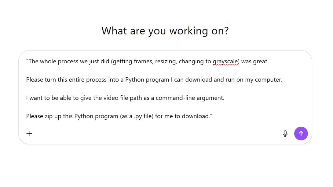
"The whole process we just did (getting frames, resizing, changing to grayscale) was great.

Please turn this entire process into a Python program I can download and run on my computer.

I want to be able to give the video file path as a command-line argument.

Please zip up this Python program (as a .py file) for me to download."
The AI will write an executable program that automates everything you just did.
This means any analysis sequence can become a reusable tool.
What AI Models To Use?
You don’t have to stick with one AI tool. Different tools work better for different tasks:

-
ChatGPT (with Advanced Data Analysis/Code Interpreter):
-
Good all-around choice. Very flexible for many tasks.
-
-
-
Right now, very good for interactive dashboards, cleaner code, and fewer mistakes. It also has a very large context window, meaning you can upload very large files or many documents at once.
-
-
-
A good alternative, deeply integrated into Google’s ecosystem.
-
-
-
This tool is a bit different. It’s great for research and finding real-time information. If you turn its ‘Focus’ mode to ‘Finance’, it can give you real-time financial and market analysis.
-
Try different tools and see what works best for your specific needs.
Building Real Applications
Data analysis does not have to stop at spreadsheets and reports. You can build full applications without knowing how to write code.
Practical Applications You Can Build

-
Traffic Analysis App: Analyze real-time traffic data and send alerts about incidents.
-
Video Privacy Tool: Automatically blur faces and identifying information in videos.
-
Investment Research Assistant: Build a database with investment information, create an interface where users ask questions and get analysis and reports.
The possibilities are massive. Data is power. AI lets you use that power without needing years of technical training.
If you want to learn how to build these kinds of applications, there are tutorials available that show you the process step-by-step using tools that let you build through conversation.
Key Takeaways To Remember
Let me summarize the important points:

When to use AI (ACHIEVE):
-
Aiding human coordination
-
Cutting out tedious tasks
-
Help provide a safety net
-
Inspire better creativity
-
Enable great ideas to scale faster
How to analyze (DIG Framework):
-
Describe your data first – verify AI understands correctly.
-
Introspect the patterns – catch mistakes early.
-
Goal-set clearly – tell AI exactly what you are trying to do.
Do not skip the Describe and Introspect steps. Yes, they feel slow. But they prevent expensive mistakes and bad analysis.
Think of AI as a smart junior analyst. You need to give it directions, verify its understanding, and check its work.
Different tools for different jobs. Try ChatGPT, Claude, and Gemini. See what works best for your needs.
Make your work reproducible. Create tracking documents and save analysis scripts.
Go beyond spreadsheets. Use AI to work with videos, images, files, and build applications.
Start Your AI Data Analysis Journey
Data analysis with AI is not about replacing your skills. It’s about making you faster, more accurate, and able to do things that were impossible before.
Start simple. Take a spreadsheet you work with often. Upload it to an AI tool. Walk through the DIG framework. See what happens.
The key is practice. Each time you use AI for analysis, you’ll get better at asking the right questions and catching potential problems.
What data will you analyze first? Give it a try and see how much time you save. You might surprise yourself with what you can find.
If you are interested in other topics and how AI is transforming different aspects of our lives or even in making money using AI with more detailed, step-by-step guidance, you can find our other articles here:
-
The Secret AI System For Endless Viral Videos (Yes, Really!)*
-
Is The Front End Dead? AI & MCP Are Making It History!*
*indicates a premium content, if any
Leave a Reply