
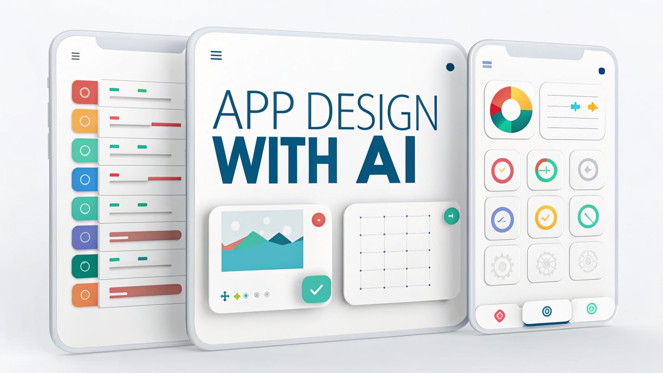
Create wow apps in just days – AI does the heavy stuff, you just guide it. No design school required!. Ai Tools.
Table of Contents
Have you ever worked super hard to build an app, making sure all its parts work just right, only to look at it and think, “Hmm, this looks like I designed it… and maybe I’m not a designer?“. If this sounds like you, don’t worry, you’re not the only one! It’s a common problem for people who are great at making things work but maybe not so great at making them look good and easy to use, especially if you’re trying to make a type of online app called a SaaS app.
So, someone made a helpful online guide to fix this exact problem. You see, there are many new tools that use something called AI to help build apps. You might have heard of tools like Lovable, Replit or V0. They’re impressive, no doubt. These tools are pretty smart and can create code that works. But sometimes, the parts of the app that people see and use – like the screens and buttons – can look a bit boring. Think of messy pages, strange colors or designs that look like they came from a very old website. One person said using these tools is like “closing your eyes and hoping you get lucky with a good-looking app“. That’s probably not how you want to impress people with your new SaaS app, is it?
But here’s the cool part: what if you could make your apps look amazing without being a design expert? There’s a new, smart way to tell your AI helper what to do, using a couple of simple steps (and a little bit of setup before you start). This method is helping lots of people create apps that look fantastic and are easy for others to use. And the best bit? You don’t need to be a design pro, you just need to guide your AI in a better way to get that professional look for your app. So, let’s check out how you can use this to make your apps go from “Okay, it works” to “Wow, this looks great and is so easy to use!“
What’s the Big Deal? Does This AI Design Thing Actually Work? (Spoiler: Yes!)
So, before we jump into how to do all this cool stuff, let’s quickly chat about why it’s even worth your time and see what cool things can happen. When we talk about “good design“, it’s not just about picking your favorite color or a funky letter style. Some app designs made with this new system look really professional and smart and that makes a big difference. Just picture an app that feels easy and right when you use it.
Here are a few things that make these designs really good and why they’re important:
-
Strategic Use of White Space (or “Negative Space”): This isn’t just blank spots on the page; it’s like giving your words and pictures some room to breathe! Think about a super messy room compared to a nice, tidy, open one. Which one feels better and is easier to walk around in? Good empty space stops things from looking too crowded, makes words easier to read and helps your eyes find the important stuff on the screen. It’s like the quiet hero of a clean look.

-
Using Special Colors Smartly: Think of these as the “look at me!” points in your app. If you use them just a little and in the right places, they make people notice important buttons or key info. If you use too many, it’s like everyone shouting at once! But if you get it just right, it helps people know where to go and what to do, making your app feel simple to use.

-
Showing What’s Happening in the App: Ever clicked a button and thought, “Did that even work?” So annoying, right? Good design shows you what’s going on. Maybe a button changes color when you press it or a box turns red if you typed something wrong or you see a happy green check when something is done. These little signs are super important so people have a good time using your app.

-
Nice Movements in the App: The way an app changes from one screen to the next or how things show up and disappear can really change how it feels. Smooth, gentle movements can make an app feel more professional, quick and even fun. It’s like watching a good dancer instead of someone just tripping over their feet!

-
Making Important Things Stand Out Clearly: This is all about making it super obvious what the most important thing is on the screen. Bigger words for titles, brighter colors for main actions and putting similar things together all help people understand things fast and move around easily. If you don’t do this, users can get lost, not knowing where to look first.

Getting all these details right isn’t about just hoping your computer program gets lucky. It’s about having a good plan. People say these great results come from new ideas that totally change how you can build an app while thinking about its look and feel from the start. This system helps you do just that, giving you control.
Learn How to Make AI Work For You!
Transform your AI skills with the AI Fire Academy Premium Plan – FREE for 14 days! Gain instant access to 500+ AI workflows, advanced tutorials, exclusive case studies and unbeatable discounts. No risks, cancel anytime.
Start Your Free Trial Today >>
The Prep Step: Creating Your AI Style Guide for Your SaaS App
Alright, let’s get practical about designing your SaaS app. The very first and arguably most crucial part of this journey is to create a comprehensive style guide. Think of this as the DNA or the master blueprint for your app’s entire look and feel. It’s the “source of truth” that you and your AI assistant will refer back to again and again when designing your SaaS app.
Why is this so important for your SaaS app? Without a style guide, design decisions tend to be made on the fly, leading to a mishmash of colors, fonts and styles that make your app look unprofessional and disjointed. A style guide ensures consistency, which is a cornerstone of good design.
Here’s how you get your AI (like Claude, ChatGPT or similar powerful language models) to create this foundational document for you:
The Goal: To prompt the AI to generate a detailed style guide tailored to your app idea.
The Prompt Structure (think of this as your instruction manual for the AI):
<goal>
You are a highly skilled product designer with deep expertise in creating visually stunning, user-friendly and cohesive applications.

Your task is to help me define the visual identity for my new app.
</goal>

<inspirations>
The attached images serve as the user's inspiration (if any). You don't need to take it literally in any way but let it serve as an understanding of what the user likes aesthetically
</inspirations>

<guidelines>
<aethetics>
- Strategic negative space: Emphasize clarity and focus by using white space effectively to avoid clutter.
- Visual density optimization: Information should be presented clearly without overwhelming the user; find the right balance.
- Clear information hierarchy: Important elements should stand out, guiding the user's attention naturally.
- Smooth motion choreography: Animations and transitions should be purposeful, fluid and enhance the user experience, not distract.
- Physics-based transitions (if applicable): Animations can feel more natural if they mimic real-world physics (e.g., an element "easing" into place rather than stopping abruptly).
[Feel free to add more aesthetic principles here, e.g., "Minimalist and clean", "Playful and vibrant", "Elegant and sophisticated", "Modern and tech-forward"]
</aethetics>

<praticalities>
- Target platforms: [e.g., iOS and Android mobile app, Web application, Desktop application]
- Color preferences (if any, otherwise let the AI suggest): [e.g., "I lean towards a calming blue as a primary color", "I'd like to explore a dark mode theme", "Avoid using too much yellow"]
- Accessibility considerations: [e.g., "Ensure color contrasts meet WCAG AA standards", "Font sizes should be easily readable"]
[Add any other specific requirements or constraints here, e.g., "The design needs to appeal to a younger audience (18-25)", "Must incorporate our existing brand logo (describe logo colors if relevant)"]
</practicalities>
</guidelines>

<content>
<app-overview>
[Provide a brief but clear description of your app. What does it do? Who is it for? What's its main purpose? For example: "My app is a recipe discovery platform where users can take photos of restaurant dishes they enjoy. The app then identifies the dish and provides Michelin-star quality recipes that users can make at home. The target audience is home cooks who love gourmet food but need guidance".]
The app is an Al-enabled voice note-taker. It allows users to take notes by speaking out their thoughts and then turns them into stored vector embeddings to enable Al features.
This is an app where you take pictures of dishes at a restaurant and give the menu description and your tasting notes and it produces you a michelin star version of that recipe to cook at home
</app-overview>
<task>
Based on all the above, create a comprehensive style guide for this application. The style guide must include detailed sections for:
- Color Palette:
    - Primary Colors (main brand colors)
    - Secondary Colors (complementary colors)
    - Accent Colors (for calls to action, highlights)
    - Functional Colors (for success, error, warning, information states – e.g., green for success, red for error)
    - Neutral Colors (for backgrounds, text, borders – e.g., shades of gray, white, black)
- Typography:
    - Font Families (choices for headings, body text, captions – specify if you want serif, sans-serif, etc.)
    - Font Sizes (for different text elements like H1, H2, Body, Caption)
    * Font Weights (bold, regular, light for different emphasis)
    * Line Height and Spacing (for readability)
- Buttons and Inputs:
    - Button Styles (primary, secondary, tertiary/text buttons – define their look in default, hover, active, disabled states)
    - Input Field Styling (text boxes, dropdowns, checkboxes, radio buttons – their look in various states)
- Card Styling (if your app uses cards to display information):
    - Layout, spacing, borders, shadow effects for cards.
- Icons:
    - Suggested icon style (e.g., line icons, filled icons, minimalist, detailed)
    - Recommendations for consistency in icon usage.
- Spacing and Layout Grids:
    - General principles for spacing between elements (e.g., using an 8pt grid system).
    - Guidelines for consistent margins and padding.
- Motion and Animations (Principles):
    - Describe the overall feel of animations (e.g., "quick and responsive", "gentle and subtle", "playful and bouncy").
    - Specify standard durations or easing functions if you have preferences.

<format>
[You can specify a format if you like, e.g., "Use Markdown with clear headings for each section". Or, let the AI choose a clear organized format. For instance:
## Color Palette
### Primary Colors
- Color 1: [HEX Code], [RGB Code] - Purpose: [e.g., Main branding, primary buttons]
...and so on for each section.]
Color Palette

Primary Colors
- Primary White - #F8F9FA (Used for backgrounds and clean surfaces)
- Primary Dark Green - #0A5F55 (Primary brand color for buttons, icons and emphasis)

Secondary Colors
- Secondary Green Light - #4CAF94 (For hover states and secondary elements)
- Secondary Green Pale - #E6F4F1 (For backgrounds, selected states and highlights)

Accent Colors
- Accent Teal - #00BFA5 (For important actions and notifications)
- Accent Yellow - #FFD54F (For warnings and highlights)

Functional Colors
- Success Green - #43A047 (For success states and confirmations)
- Error Red - #E53935 (For errors and destructive actions)
- Neutral Gray - #9E9E9E (For secondary text and disabled states)
- Dark Gray - #424242 (For primary text)

Background Colors
- Background White - #FFFFFF (Pure white for cards and content areas)
- Background Light - #F5F7F9 (Subtle off-white for app background)
- Background Dark - #263238 (For dark mode primary background)

Typography
Font Family
- Primary Font: SF Pro Text (iOS) / Roboto (Android)
- Alternative Font: Inter (Web fallback)

Font Weights
- Regular: 400
- Medium: 500
- Semibold: 600
- Bold: 700

Text Styles
Headings
- H1: 28px/32px, Bold, Letter spacing -0.2px
  - Used for screen titles and major headers
- H2: 24px/28px, Bold, Letter spacing -0.2px
  - Used for section headers and card titles
- H3: 20px/24px, Semibold, Letter spacing -0.1px
  - Used for subsection headers and important text

Body Text
- Body Large: 17px/24px, Regular, Letter spacing 0px
  - Primary reading text for transcript content
- Body: 15px/20px, Regular, Letter spacing 0px
  - Secondary information and supporting text

Special Text
- Caption: 12px/16px, Medium, Letter spacing 0.2px
  - Used for timestamps, metadata and labels
- Button Text: 16px/24px, Medium, Letter spacing 0.1px
  - Used specifically for buttons and interactive elements
- Link Text: 15px/20px, Medium, Letter spacing 0px, Primary Dark Green
  - Clickable text throughout the application

Component Styling
Buttons
- Primary Button
  - Background: Primary Dark Green (#0A5F55)
  - Text: White (#FFFFFF)
  - Height: 48dp
  - Corner Radius: 8dp
  - Padding: 16dp horizontal
- Secondary Button
  - Border: 1.5dp Primary Dark Green (#0A5F55)
  - Text: Primary Dark Green (#0A5F55)
  - Background: Transparent
  - Height: 48dp
  - Corner Radius: 8dp
- Text Button
  - Text: Primary Dark Green (#0A5F55)
  - No background or border
  - Height: 44dp

Cards
- Background: White (#FFFFFF)
- Shadow: Y-offset 2dp, Blur 8dp, Opacity 8%
- Corner Radius: 12dp
- Padding: 16dp

Input Fields
- Height: 56dp
- Corner Radius: 8dp
- Border: 1dp Neutral Gray (#9E9E9E)
- Active Border: 2dp Primary Dark Green (#0A5F55)
- Background: White (#FFFFFF)
- Text: Dark Gray (#424242)
- Placeholder Text: Neutral Gray (#9E9E9E)

Icons
- Primary Icons: 24dp x 24dp
- Small Icons: 20dp x 20dp
- Navigation Icons: 28dp x 28dp
- Primary color for interactive icons: Primary Dark Green (#0A5F55)
- Secondary color for inactive/decorative icons: Neutral - Gray (#9E9E9E)

Spacing System
- 4dp - Micro spacing (between related elements)
- 8dp - Small spacing (internal padding)
- 16dp - Default spacing (standard margins)
- 24dp - Medium spacing (between sections)
- 32dp - Large spacing (major sections separation)
- 48dp - Extra large spacing (screen padding top/bottom)

Motion & Animation
- Standard Transition: 200ms, Ease-out curve
- Emphasis Transition: 300ms, Spring curve (tension: 300, friction: 35)
- Microinteractions: 150ms, Ease-in-out
- Page Transitions: 350ms, Custom cubic-bezier (0.2, 0.8, 0.2, 1)

Dark Mode Variants
- Dark Background: #121212 (primary dark background)
- Dark Surface: #1E1E1E (card backgrounds)
- Dark Primary Green: #26A69A (adjusted for contrast)
- Dark Text Primary: #EEEEEE
- Dark Text Secondary: #B0BEC5


</format>
</task>
</content>
*Note: Adjust and remove the [..] part before using the prompt. These parts are just an explanation of how you should do these parts.
Let’s Revisit the Recipe App Example:
Imagine using a similar prompt for a recipe app idea (snap a pic of a fancy restaurant dish, get a recipe to make it at home). After feeding detailed instructions to an AI like Claude, it could generate an incredibly thorough style guide. It wouldn’t just pick a few colors; it would define the entire visual language:
-
Color Palettes: Specific shades for primary actions, secondary information, vibrant accents for delicious food imagery and functional colors for notifications.
-
Typography: Recommendations for fonts that evoke a “gourmet yet accessible” feel, with clear sizes and weights for headings, ingredient lists and instructions.
-
Component Styling: How buttons should look, how recipe cards should be laid out.
-
Animation Principles: Suggestions for how transitions could make the app design feel more engaging, like a subtle shimmer when a recipe is revealed.

The Power of This “Source of Truth”:
Once this style guide is generated, it’s golden. It’s your app’s design constitution. No more guessing games about what shade of blue to use or how big a button should be. Every design decision from this point forward can be checked against this guide. This single step massively boosts consistency and gives you a professional foundation to build upon. It’s the difference between an architect carefully drawing up blueprints before construction and just starting to nail boards together randomly.
Step 1: Think Like a Product Designer, Not a Developer
Okay, you’ve got your style guide – your app’s DNA. Now for the part that many describe as a real “moment” of clarity, the step that can start making designs consistently “super high-quality“. This is where you shift the AI’s “brain” from just being a code-writer or a style-copier to being a thoughtful product designer.
Why is this shift so critical? Think about it: developers and product designers often approach building a screen or a feature from very different angles.
-
A Developer’s Mindset (Often): “How do I make this function? What data does it need? What APIs will it call? How do I handle the logic?” It’s all about the underlying mechanics, the engine under the hood. And that’s essential!
-
A Product Designer’s Mindset: “How will a person experience this? What do they need to see first? How can I make it obvious what to do next? How does this screen make them feel? How can I guide them smoothly from A to B?” It’s about the user’s journey, their understanding, their emotions and the overall ease of use.
Neither mindset is “better“; they’re just different and focus on different, equally important aspects. The problem is, if you only use the developer mindset to design a UI, you might get something that works but feels awkward, confusing or overwhelming – like a powerful engine in a car with no steering wheel and square tires!
This step forces the AI to put on its “product designer hat” before any code for the UI is even considered. It makes the AI think deeply about the user experience for each feature and screen.
What Does a Product Designer Consider? Let’s Break It Down (Simply!):
-
Information Architecture: This sounds fancy but it’s just about how information is organized and structured so it makes sense to the user. Think of how a library organizes books by genre and author so you can easily find what you’re looking for. A well-designed app does the same with its features and content.
-
Progressive Disclosure: This means revealing information gradually, only when the user needs it, instead of throwing everything at them at once. It’s like a good teacher who introduces concepts step-by-step, rather than handing you the entire textbook on day one and saying “Good luck!”
-
Visual Hierarchy: This is about using design elements (like size, color, placement) to show the user what’s most important on the screen and what’s secondary. A big, bold headline grabs your attention before the smaller print, right? That’s visual hierarchy in action.
-
Interactive Components: This covers how buttons, sliders, menus and other interactive elements look and behave. Do they clearly look clickable? Do they give you feedback when you interact with them?
-
Animations and Transitions: These are the “moves” in your app – how screens change, how elements appear or disappear. Good animations make the app feel smooth, polished and responsive, guiding the user rather than jarring them.
-
Copywriting (The Words!): The text on your screens is crucial! Is it clear, concise and friendly? Does it use a tone that matches your app’s personality? Good copywriting makes the app easy to understand and pleasant to use.
-
Feedback Signals to Users: These are little cues that tell the user the app design has understood their action. A button changing color when tapped, a spinning icon while something loads or a little “message sent!” confirmation – these signals prevent confusion and frustration.
The Prompt Structure for Making the AI a Product Designer: the Prompt.

The Astonishing Output – Using the Recipe App Example Again:
Go to Claude, create a new chat and paste our new prompt into it.
When app features are run through this “product designer” prompt, the AI doesn’t just spit out vague ideas. It can generate incredibly detailed specifications. For example, for a recipe app’s camera screen:
-
Default State: It might describe what the camera view should look like, the placement and appearance of the shutter button (e.g., “the primary shutter button should be centered at the bottom, using the primary color defined in the style guide“).
-
After Photo Capture: How the UI changes – maybe a preview of the photo appears.
-
During Photo Analysis: What the user sees while the app is “thinking” (e.g., “during analysis, the background of the captured image preview should go into a semi-transparent mode with a subtle, pulsing animation to indicate processing“).
-
Results Display: How the matching recipes are presented.

This level of detail – specifying colors, animations and the why behind design choices for each screen state – is exactly what a human product designer would provide to a development team. It’s a world away from just saying “add a camera feature”. This detailed blueprint is the magic ingredient that typical AI code generators miss if you prompt them directly for code.
Love AI? Love news? ☕️ Help me fuel the future of AI (and keep us awake) by donating a coffee or two! Your support keeps the ideas flowing and the code crunching. 🧠✨ Fuel my creativity here!
Step 2: Building the Design Screens
Now for the grand finale! You have your comprehensive style guide (the DNA) and your detailed product designer specifications (the architectural blueprints). It’s finally time to bring your vision to life and actually build the screens for your SaaS app.
The Tools for the Job:
-
A Basic React Project: React is a very popular JavaScript library for building user interfaces. Think of it as a powerful set of building blocks for creating the visual parts of websites and apps.
-
First, you’ll need to install Node.js.

-
Locate the downloaded
.msifile and double-click to run it. -
Follow the prompts in the setup wizard, accept the license agreement and use the default settings for installation.
-
Open Command Prompt or PowerShell > Check the installed versions by running these commands:
-
Type
node -vand press Enter to check the Node.js version. -
Type
npm -vand press Enter to check the npm version. -
Both commands should return version numbers, confirming successful installation.
-

-
Then, we install CRA (Create React App) globally by typing
npm install -g create-react-app.

-
To check that everything went well, run the command
create-react-app --version.

-
Then, setting up a basic project is usually quite straightforward with standard commands like:
mkdir YouTube_Example
cd YouTube_Example
npx create-react-app recipe-designs
cd recipe-designs
npm start

Don’t worry if these commands look like Greek; they are standard first steps for many web projects and there are tons of beginner guides online if you’re new to this.
-
An AI-Powered IDE (Integrated Development Environment) like Cursor or Windsurf: Think of these as super-smart code editors. They have AI built into them that can understand your instructions (and your previously generated specs!) and help write the actual code. These tools can often work with powerful AI models.
-
First, copy this prompt. Make sure you adjust it a little bit based on your purpose.
-
Add 2 documents in pre-step and step 1 into the prompt above.

-
Let’s open Cursor or Windsurf and open the folder (It’s maybe somewhere in your C:Users…YouTube_Example) to add the prompt.

-
Paste our prompt into it and turn on thinking model in the model.

*Note: I prefer you use the model “Claude 3.7 Sonnet MAX” for the best performer. But if you don’t have it, you can still use the model “Claude 3.7 Sonnet” and chat until you get the perfect SaaS app.
-
Then we move to Coffee Time where we enjoy our drink and wait for the code to run.


One Screen at a Time – The Iterative Advantage:
It’s wisely recommended to build screens one at a time for your SaaS app. Why?
-
More Control: It’s easier for you (and the AI) to focus on getting one screen right.
-
Easier Iteration: If something isn’t quite perfect, you can provide feedback and have the AI adjust that single screen before moving on. Trying to generate an entire multi-screen app in one go is like asking an artist to paint a giant mural in ten minutes – the details will suffer.
-
Less Overwhelming: For both you and the AI, dealing with the project in smaller, manageable chunks is much more efficient.
After some time with the AI working in an environment like Cursor, you could have several screens for an app design. Are they always 100% perfect down to the last pixel? Maybe not. One might observe, for example, a font choice that isn’t quite to their liking, perhaps a “serif font” (think fonts like Times New Roman, with the little “feet” on the letters) where a cleaner sans-serif style was preferred.

But here’s the key: the overall structure, layout, color usage and component placement can be incredibly impressive and directly reflect the detailed specifications. That font choice? That’s often a minor tweak, easily fixed in code or by refining the typography section in the style guide for future generations. The system can get you 95% of the way there with minimal human effort, bypassing weeks of potential design and coding struggles.
The Big Picture: How This Process Revolutionizes Your App Design
Taking a step back, this Prep Step + 2-Step AI prompting system isn’t just a neat trick; it fundamentally changes how you can approach building apps, especially if you’re not a designer. It tackles several huge pain points:
-
Unwavering Consistency: Remember that style guide? It’s your design bible. By constantly referring the AI back to it, you eliminate those random, “oops, I used three different shades of blue” moments. Colors, fonts, spacing button styles – everything stays harmonious across your entire app. This alone makes your app feel more professional.
-
Built-in Professional Quality: Forcing the AI to think like a product designer (Step 1) before writing code (Step 2) means your app designs aren’t just functional; it’s designed with the user experience in mind. Established UX principles (like visual hierarchy, clear feedback and progressive disclosure) get baked in automatically because the AI has been guided to consider them.
-
Skyrocketing Efficiency: Imagine how much time is wasted when developers build a feature, only for it to look or feel wrong, requiring significant rework. This process front-loads the design thinking. By having incredibly detailed visual and UX specifications before a single line of UI code is written, you drastically reduce misunderstandings, revisions and wasted effort. It’s the digital equivalent of “measure twice, cut once”.
-
Effortless Scalability: Once you have your style guide and get comfortable with this prompting system, you can apply it to any new feature or even entirely new apps. The system itself is scalable, allowing you to consistently produce high-quality designs regardless of the project’s size.
As one insightful creator explained, “This stage is really critical because once we have these screens, we can go out and build something like the databases, backend schemas, APIs, front-end systems… we already have so much of the thinking out of the way“. You’re no longer fumbling in the dark, hoping a feature turns out okay. You have a clear, visually defined target for your SaaS app.
The result? You stop ending up with features that “look nothing like what you wanted” and are instead built with “all this other random stuff” that leads to bloated, inconsistent and frustrating codebases. This system brings intention and clarity to your design process.
Pro Tips for Squeezing Every Last Drop of Awesome from This Method
To truly get the best results and make this AI-assisted design process sing, consider a few extra golden nuggets of advice:
-
Get Specific About Your Users (User Personas): The more the AI understands who your app is for, the better its design choices will be. Are you designing for busy professionals, tech-savvy teens or retired hobbyists? Briefly describing your target user (sometimes called a “user persona”) in your prompts can help the AI tailor the aesthetics and usability. For example, an app for seniors might prioritize larger fonts and simpler navigation.
-
Use Real Content, Not Just “Lorem Ipsum”: “Lorem ipsum” is that placeholder Latin text you often see in design mockups. While it’s okay for very early wireframes, using real (or realistic) content examples as soon as possible is much better. Real text and images will reveal how well your design actually works – does the text fit? Do the images look good in the layout? This helps the AI (and you) make more informed design decisions.
-
Embrace Iterative Refinement (Talk to Your AI!): Don’t expect the very first output to be the final masterpiece. Think of the AI as a highly skilled but very literal assistant. It needs clear instructions. If you don’t like something, tell it! “Can you make that button color match the primary accent color from the style guide?” “Could you try a version of this screen with more white space around the title?” This is a collaborative process. The more specific your feedback, the better the revisions will be.
-
Gather Inspiration (But Don’t Copy!): Look at other apps you admire. Tools like Mobbin showcase thousands of well-designed app screens. Use these for inspiration. You can even tell your AI, “I like the clean and minimalist feel of [App X’s] settings screen. Can we aim for a similar aesthetic for my app’s settings, keeping my style guide in mind?” This gives the AI a visual reference point without asking it to plagiarize.
-
Document and Reuse Your Wins: That amazing style guide your AI created? Save it! Use it consistently for every new feature you add to your app design. Over time, you might even build a library of different style guides for different types of projects. This consistency is key to building a professional and recognizable brand.
Conclusion: App Design Like a Pro, No Degree Required!
This “smart steps” method for making apps look good is a real game-changer, especially if you haven’t studied design. You just guide your AI helper through a few stages – setting up a design base, getting it to think like a pro designer, then building the app’s look. It’s how you turn a great app idea into a great-looking app design without the usual headache!
The best part? It’s a clear plan that actually works. No more just hoping your AI spits out something decent or jokingly praying to tech statues for a design miracle. Now you have a method you can use again and again. With a bit of practice, you’ll consistently create designs that impress, not ones that look like they’re from the internet’s stone age.
This doesn’t mean human designers aren’t needed – their skills are super valuable. But if you’re making your own projects and want them to look great without a big design budget, this method is a fantastic boost, helping you do more yourself.
As one expert put it, “Oftentimes, breaking down these problems into smaller individual problems is really all that’s needed. You experiment, you iterate, you experiment some more and you’re bound to eventually create something that’s pretty awesome“.
So, ready to stop being just a “coder who designs” and start making app designs that look like a pro made them? Give this a try on your next project. You and your AI helper might just amaze yourselves!
If you are interested in other topics and how AI is transforming different aspects of our lives, or even in making money using AI with more detailed, step-by-step guidance, you can find our other articles here:
-
ChatGPT Canvas: The AI Tool You Didn’t Know You Needed (While Top Creators Did)
-
Detailed Guide: How To Automatically Get Unlimited High-Quality LinkedIn Jobs*
-
How I Replaced My Startup Team with AI Automation – And You Can Too
-
Build Your Dream SaaS App in 48 Hours Using AI (No Tech Skills, No Problem!)
*indicates a premium content, if any
Leave a Reply