
Boring slides! Use AI to create stunning, high-impact course materials that keep students hooked and boost engagement effortlessly
How do you prefer to present your course content? 🎨📚Which presentation format do you find most effective for engaging and educating your students?
|
|
Table of Contents
Great content deserves great delivery! Your course materials – slides, visuals, and downloadable resources – aren’t just “extras.” They shape how your students absorb information, making or breaking engagement.
But don’t worry – you don’t need to be a graphic designer to create polished, professional-looking materials. In this lesson, you’ll learn:
✅ Choosing the Right Presentation Format: which format best suits your content and audience?
✅ Best Practices for Layout and Design: design the layout effectively.
✅ Organizing Content Flow: design a logical, step-by-step learning journey.
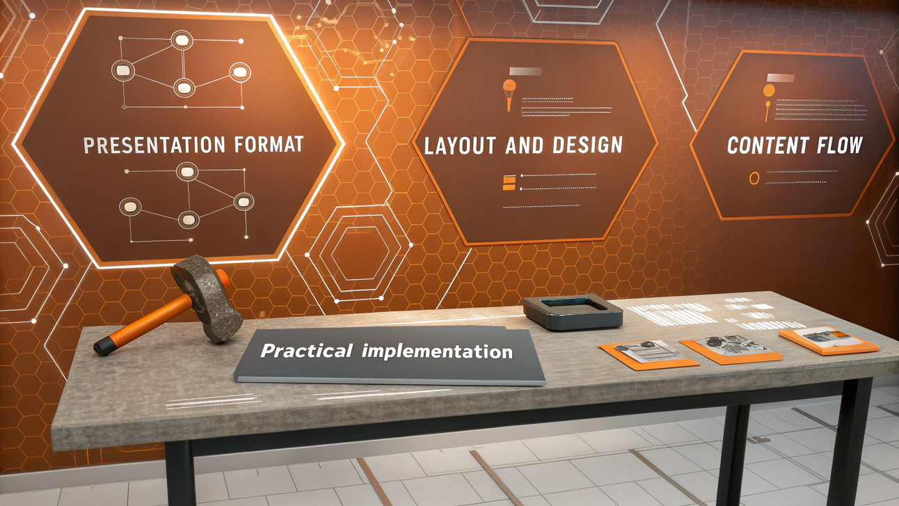
✅ Practical Implementation: ties everything together.
Access AI Course Catalyst now to get the fastest and most detailed lessons!
Let’s make your course look as good as it teaches! 🚀
✅ 1. Choosing the Right Presentation Format
The way you present your course content is just as important as the content itself. A well-chosen format boosts engagement, improves retention, and makes your life easier when creating and updating materials. So, let’s break it down!
Before choosing the right format, you need to understand the key factors that influence your decision:
|
Category |
Factor |
Best Format Choice |
|---|---|---|
|
Content-Based Considerations |
Conceptual Complexity |
Dynamic visuals for illustrating relationships, interactive elements for in-depth exploration |
|
Procedural vs. Declarative Knowledge |
Interactive environments for hands-on learning (procedural), structured slides for factual content (declarative) |
|
|
Visual Dependency |
High-quality visual presentations for design-heavy topics, text-based slides for conceptual subjects |
|
|
Learner & Accessibility Considerations |
Technical Proficiency of Students |
Traditional slides for all skill levels, interactive formats for tech-savvy audiences |
|
Learning Preferences |
A mix of slides, visuals, and interactive components to accommodate different styles |
|
|
Access Considerations |
Low-bandwidth-friendly slides for global accessibility, web-based interactive formats for high-speed internet users |
|
|
Resource & Practical Considerations |
Production Capabilities |
Realistically assess your technical skills, available tools, and production timeline |
|
Budget Constraints |
Consider costs associated with specialized software, design services, or platform requirements |
|
|
Maintenance Requirements |
More complex formats may require more frequent updates or technical maintenance |
Advanced: Many successful courses combine multiple presentation formats to leverage the strengths of each:
|
Strategy |
Description |
Best Use Case |
|
Module-Based Variation |
Different formats for different sections of a course |
When topics require varied instructional methods (e.g., lectures for theory, interactive exercises for practice) |
|
Progression-Based Adaptation |
Adjust format as learners progress |
Beginners start with structured slides; advanced learners get interactive case studies |
|
Complementary Resources |
Supplement the primary format with additional materials |
PDFs, quizzes, and discussion forums enhance engagement and retention |
So, what options do we have when selecting a presentation format? Here’s a quick breakdown of the main options:
|
Format |
Pros |
Cons |
|---|---|---|
|
Traditional Slide Presentations (PowerPoint, Keynote, Google Slides) |
✅ Easy to create and update ✅ Structured and familiar for learners |
❌ Can be passive and uninspiring if overused |
|
Dynamic Visual Presentations (Prezi) |
✅ Great for storytelling and concept relationships ✅ Helps maintain attention with movement |
❌ Requires more design effort |
|
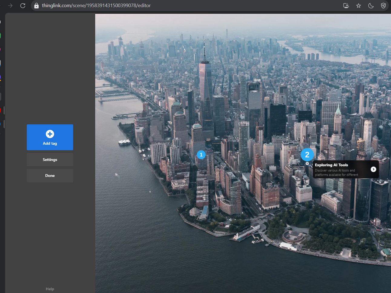
Interactive Learning Environments (ThingLink) |
✅ Engages students with hands-on learning ✅ Provides personalized feedback |
❌ More complex and time-consuming to set up |
A mix of these formats often works best.
For example, a course on digital marketing might use:
– Slide presentations for explaining core concepts and frameworks
– Interactive demonstrations for teaching platform-specific skills
– Branching scenarios for practicing decision-making with clients
– Video walkthroughs for demonstrating software tools
– Downloadable templates for implementing strategies
Pro tip: Choosing the right presentation format isn’t just about preference – let data guide your decision.

Traditional Slide Presentation

Dynamic Visual Presentation
Interactive Learning Environment
✅ 2. Best Practices for Layout and Design
Even the best content can flop if your design is chaotic. Think of your course materials like a great meal – if it looks unappetizing, no one will want to dig in! Let’s break down how to make your slides and visuals as effective as they are eye-catching!
Here are my recommendations for creating an effective presentation. Just follow my table without thinking too much “Did I adjust this too much or not?”
|
Principle |
Key Actions |
Pro Tip |
|---|---|---|
|
1️⃣ Visual Hierarchy |
– Make headings bigger than body text (1.5:1 ratio). |
Think like a movie poster – title first, key points next, details last. |
|
2️⃣ Consistent Branding |
– Stick to 2-3 primary colors + 2-3 complementary colors. |
Create a simple style guide to keep branding consistent. |
|
3️⃣ Reduce Cognitive Load |
– Limit text to 30-40 words max per slide. |
If you wouldn’t read it aloud, it’s too much text! |
|
4️⃣ Typography |
– Use Sans-serif fonts (Arial, Calibri) for screens. |
Use bold instead of all caps – no one likes being yelled at! |
|
5️⃣ Text Formatting |
– Headings: 28-36pt, Body: 18-24pt, Captions: 14pt. |
Stick to bold for emphasis – italics and underlining reduce readability. |
|
6️⃣ Color Psychology |
– 🔵 Blue = Trust & focus. |
Follow the 60-30-10 rule (60% primary, 30% secondary, 10% accent). |
|
7️⃣ Practical Color Implementation |
– Choose 1 primary brand color that matches your course theme. |
Test your palette with WebAIM Contrast Checker for accessibility. |
|
8️⃣ Images & Graphics |
– Use diagrams for complex ideas. |
Only use high-resolution images – blurry visuals look unprofessional! |
|
9️⃣ Icons & Visual Elements |
– Keep icon styles consistent throughout your course. |
Flaticon, The Noun Project & Canva offer great free icons! |
|
🔟 Accessibility |
– Ensure high contrast text (4.5:1 ratio). |
Test with WebAIM or WAVE to ensure accessibility. |
Good design isn’t just about looks – it enhances learning. Keep it clean, structured, and engaging to create a professional and enjoyable course experience. 🚀
Here are my top recommended websites you should try:
-
Visual Hierarchy: Canva – Drag-and-drop design tool for structuring visual elements and layouts.
-
Consistent Branding: Coolors – Generates color palettes for cohesive branding.
-
Cognitive Load Management/Accessibility: Adobe Color Contrast Checker – Ensures readable text-to-background contrast.
-
Typography: Google Fonts – Provides recommended font pairings like Montserrat + Open Sans.
-
Text Formatting: Hemingway Editor – Helps structure text for readability.
-
Color Psychology/Practical Coolor Implementation: Khroma – Uses AI to suggest color combinations based on preferences.
-
Images & Graphics: Pexels – Free images and videos for educational materials.
-
Icons & Visual Elements: Flaticon – Free vector icons and graphics.
Here is a more visual example based on AI Fire course to help you understand better. In AI Fire, we used exactly the principles above:
-
Visual Hierarchy/Text Formatting: As you can see, a heading is bigger than a description helps you pay attention better.

-
Consistent Branding/Cognitive Load Management/Typography/Accessibility: Some time less is more, you don’t need a lot of fonts. Just stick with 2-3 fonts.

-
Color Psychology/Practical Coolor Implementation: Red and orange are our key colors. Because AI is new and changes every day.

-
Images & Graphics/Icons & Visual Elements: We used icons for each lesson to help students easy to follow. Also in each lesson, we used real examples as case studies to help students avoid bad things and learn good things.

This is just the first chapter of your course creation story. Want the full playbook?
✅ 3. Organizing Content Flow
A well-designed layout is just the first step – how you organize your content flow is what truly determines how well students absorb and apply what they learn. Even with great visuals, if your lessons jump around or feel disconnected, learners will struggle to follow along.
To create a seamless learning experience, structure your content logically to guide students effortlessly from one concept to the next. By strategically sequencing your lessons, you reduce cognitive overload, boost engagement, and help students build confidence step by step.
1️⃣ Structuring Content for Learning Progression
Structuring Content for Learning Progression is all about guiding students through a learning journey that feels natural and intuitive. When lessons are arranged in the right order, students grasp concepts faster, retain information better, and stay motivated to continue.
Think of it like building a house – you start with a strong foundation before adding walls, then finish with the details. In the same way, structuring your content from simple to complex, known to unknown, or problem to solution ensures students always have the context they need to progress with confidence. Use these sequencing strategies:
-
Simple to Complex: Start with foundational concepts before moving into advanced topics.
-
Example: In NewsletterAZ Course, we start from simple things to complex.
-

-
Known to Unknown: Connect new ideas to students’ prior knowledge to improve understanding.
-
Example: AI Mastery AZ Course, we have advanced tips for you about using ChatGPT.
-

-
Concrete to Abstract: Show practical examples first before introducing complex theories.
-
Example: Before discussing sales psychology, analyze real-world examples of high-converting sales pages.
-
-
General to Specific: Provide a broad overview before diving into details.
-
Example: In the previous lesson, before going into detail. We show you a roadmap to help you follow easily.
-

-
Problem to Solution: Frame lessons around challenges and their solutions to keep students engaged.
-
Example: Highlight content creation struggles before demonstrating how AI can simplify the process.
-
If you struggle with this part, maybe you should try Notion. It helps you to organize and structure course content logically.

2️⃣ Managing Cognitive Load: Avoiding Overwhelm
Managing Cognitive Load: Avoiding Overwhelm is key to keeping students engaged and ensuring they absorb what they’re learning. If your course feels like drinking from a firehose, students will get frustrated, check out, or give up entirely.
The goal isn’t just to deliver information – it’s to make learning manageable, memorable, and motivating. By breaking content into digestible chunks, reinforcing key points in multiple ways, and giving students space to process, you create a learning experience that feels effortless rather than exhausting.
Let’s dive into practical strategies to keep students engaged without overwhelming them!
-
Progressive Disclosure: Introduce information in small steps instead of presenting everything at once. Each slide or section should contain only one key learning point.
-
Example: In lesson 1, we introduced you to a keyword for each section to avoid overwhelm.
-

-
Strategic Redundancy: Reinforce important concepts using different formats (spoken, written, visual).
-
Example: A core concept can be introduced in the text, demonstrated in a video, and reinforced with an interactive activity.
-
-
Contextual Grouping: Place related concepts together and use visual cues (color, icons, spacing) to show connections.
-
Cognitive Breathing Space: Give students mental breaks between complex sections. Use short reflection questions, quick interactive activities, or visually minimal slides to allow them to process information.
Instead of forcing students to absorb all the knowledge, break down large sections to make the lesson less overwhelming. To help you with this, I would like to introduce a website ThingLink – It adds multimedia elements to reinforce learning in different formats.

3️⃣ Chunking Content for Better Retention
Information overload is one of the fastest ways to lose student engagement. Instead of overwhelming learners with long, dense lessons, chunking breaks content into bite-sized, digestible sections that enhance focus and retention.
Think of it like a playlist: short, well-organized tracks make it easier to stay engaged and follow along. By structuring lessons into small, meaningful segments, you help students process information more efficiently and apply what they learn step by step.
|
Level |
Purpose |
Typical Duration |
|---|---|---|
|
Module-Level |
Covers a broad topic or skill. |
30-45 minutes |
|
Lesson-Level |
Focuses on one key concept or skill. |
5-15 minutes |
|
Segment-Level |
Small, focused sections covering a single point. |
2-5 minutes |
-
Example of Effective Chunking:
-
Module: AI-Powered Content Creation
-
Lesson: Understanding AI Writing Tools (10 min)
-
Segment 1: Types of AI writing assistants (3 min)
-
Segment 2: AI tool limitations (3 min)
-
Segment 3: Ethical considerations (4 min)
-
-
-
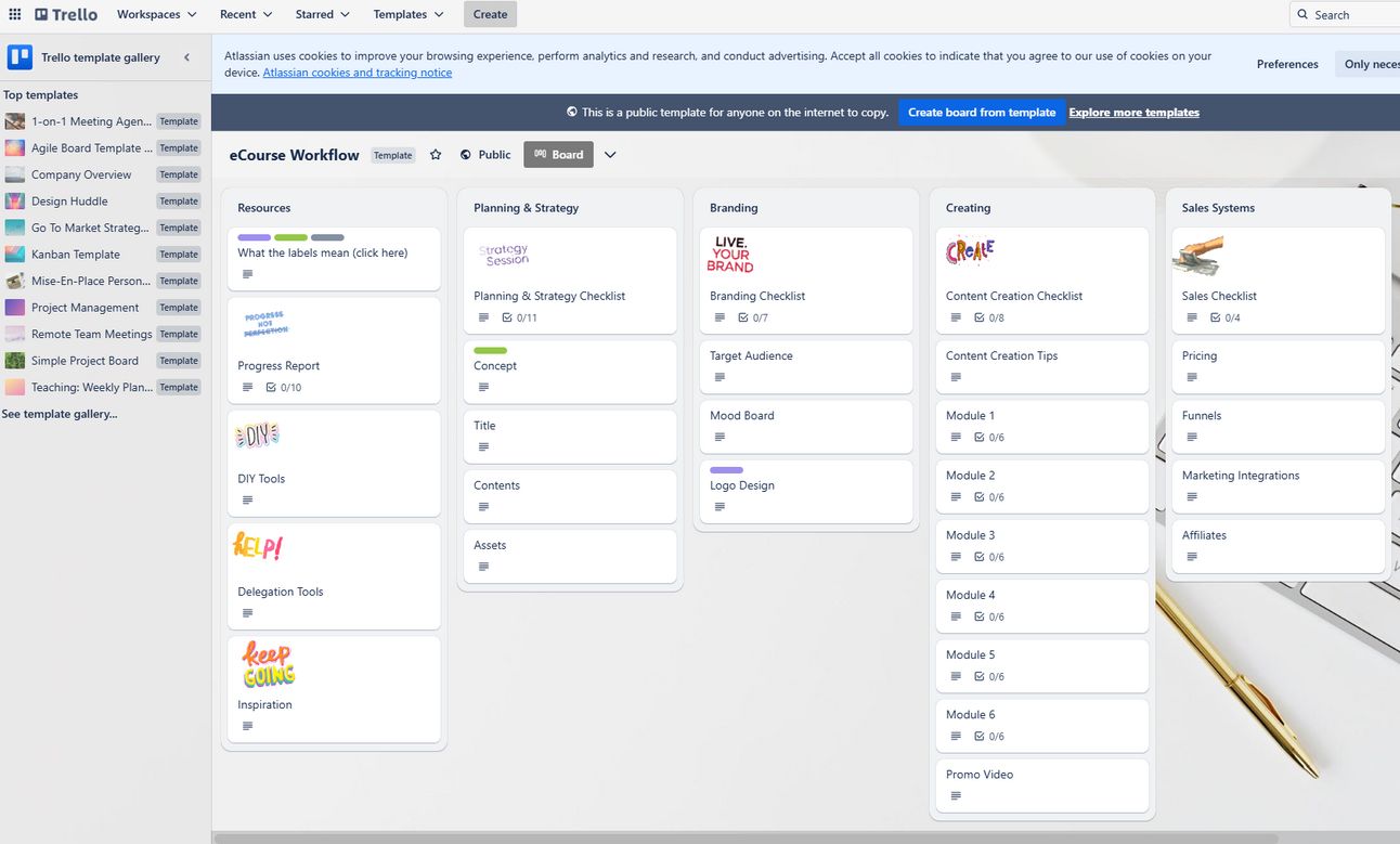
Trello is the website that helps you break down lessons into manageable chunks using cards and boards. You can use available templates or customize them for your lesson.
Ever felt lost in a long course, unsure of what’s next? That’s exactly what we want to avoid for students. Clear visual cues act like road signs, guiding learners through the content and making navigation effortless.
Learners feel more in control and can track their progress easily, reducing frustration. Help students know where they are in the course with clear visual signposts:
-
Module Signaling: Use distinctive title slides with unique colors or imagery for each module.
-
Lesson Demarcation: Keep lesson headers consistent in style and numbering.
-
Segment Transitions: Subtle changes like background variations or section dividers help indicate shifts.
-
Progress Indicators: Visual cues (e.g., progress bars, checkmarks) show students how far they’ve come and what’s next.
Canva is a famous website for creating and designing visually distinct modules, lessons, and progress indicators. It’s also FREE and easy to use, you can use a template if you’re lazy like me.

5️⃣ Creating Smooth Transitions Between Sections
Jumping abruptly between topics can feel like switching TV channels mid-sentence – confusing and disorienting. Smooth transitions help maintain the flow, making the learning experience feel cohesive and intuitive.
By using verbal cues, visual bridges, and logical sequencing, you ensure students stay engaged and understand how each concept connects.
-
Verbal Transitions:
-
Summarizing: “Now that we’ve covered the basics of prompt engineering…”
-
Previewing: “Next, we’ll explore three powerful AI automation strategies…”
-
Questioning: “How can we apply this concept to real-world marketing?”
-
Comparing: “Unlike traditional methods, AI-driven workflows offer…”
-
Sequencing: “The second step in this process involves…”
-
-
Visual Transitions:
-
Bridge slides that introduce new topics
-
Consistent navigation cues like arrows or section titles
-
Animations that connect related ideas smoothly
-
Same with the “Visual Cues” part above, you could use Canva to create a smooth transition. In advance, I want to share for you LottieFiles, It’s a free website to create, edit, collaborate on, and implement lightweight animations across websites, apps, social,s and more

6️⃣ Balancing Content Density & Clarity
More content doesn’t always mean better learning. Overloading students with information can lead to confusion and burnout. Instead, the key is to balance depth with clarity, ensuring each lesson is concise, engaging, and actionable.
By simplifying complex ideas, prioritizing key takeaways, and using multi-modal reinforcement, you help learners absorb information more effectively without feeling overwhelmed. Follow these guidelines:
-
Simplify Complex Topics: Use visuals, step-by-step breakdowns, and plain language.
-
Adjust for Student Expertise: Beginners need more explanations, while experienced learners can handle denser content.
-
Prioritize Key Information:
-
Must-Know: Core learning objectives
-
Should-Know: Supporting details
-
Nice-to-Know: Extra insights for curious learners
-
-
Use the 30% Rule: Keep at least 30% of a slide as white space to improve readability.
-
Multi-Modal Reinforcement: Present key ideas in multiple ways:
✔ Spoken narration
✔ Visual slides
✔ Text highlights
✔ Real-world applications
Here, I think Venngage is a lovely website you should try. It allows you to design infographics and simple visual breakdowns for clarity.

✅ 4. Practical Implementation: Creating Your Presentation Materials
Now that you have a solid grasp of design principles and content structuring, it’s time to put everything into action! Creating engaging and professional presentation materials requires a well-planned approach to ensure clarity, consistency, and an interactive learning experience.
From content planning to tool selection, each step plays a crucial role in making your course materials visually appealing, easy to navigate, and impactful. Let’s break down the practical steps to bring your presentations to life! 🎨📊
1️⃣ Content Planning – Laying the Foundation
Great presentations don’t just happen – they start with a solid plan! Content planning ensures your materials are well-structured, visually cohesive, and aligned with your learning objectives.
Think of it as mapping out a journey for your students. When your content is logically organized and visually supported, students can process information efficiently and stay engaged.
Let’s explore how to lay the foundation for a well-organized presentation!
-
Outline Your Content: Define your modules, lessons, and key learning points. Use chunking techniques to break down complex information.
-
Visual Strategy: Select consistent colors, fonts, and image styles to maintain a professional look. Plan animations, transitions, and navigation cues.
-
Gather Resources: Collect necessary assets – stock images, icons, diagrams, screenshots, and reference materials – before production begins.
Struggling with lesson structure? Notion makes it easy to outline content, organize lessons, and keep everything in one place – flexible, clear, and collaborative.

2️⃣ Template Creation – Ensuring Consistency
Ever seen a presentation where every slide looks different? It’s distracting! Using consistent templates not only saves time but also improves the professionalism and readability of your course materials.
By standardizing layouts, fonts, colors, and navigation elements, you create a seamless experience that keeps learners focused on the content rather than adjusting to design changes.
-
Master Slide Development: Create standardized layouts for titles, content, examples, activities, and transitions.
-
Style Guide: Document color codes, font choices, spacing rules, and animation settings for consistency.
-
Template Testing: Ensure readability across different screen sizes and devices. Test for accessibility and visual hierarchy.
Need sleek, professional slides without the hassle? Canva lets you design polished templates effortlessly. With customizable layouts, fonts, and colors, you can maintain a consistent, engaging look – no design skills are required!

3️⃣ Production – Bringing It All Together
With your plan and templates in place, it’s time to bring everything to life! Production is where content, design, and interactivity merge to create an engaging learning experience.
To ensure high quality, you’ll need a structured workflow, regular reviews, and iterative refinements. Instead of rushing through the process, batch-processing elements and testing at different stages will help maintain clarity and effectiveness.
-
Batch Processing: Work in focused stages – first create all title slides, then all key concept slides, then all interactive elements.
-
Progressive Review: Check your work in multiple rounds:
✔ Self-review for clarity and accuracy
✔ Peer review for engagement and effectiveness
✔ Design review for consistency
✔ Technical review for functionality across platforms
✔ Student testing for usability and comprehension -
Refinement: Adjust based on feedback – simplify complex slides, improve visuals, and resolve compatibility issues.
Want to make your presentations more dynamic? Prezi transforms static slides into dynamic, non-linear experiences. With smooth zooming and movement, it keeps learners engaged and simplifies complex ideas.

4️⃣ Choosing the Right Tools
The right tools can make or break your course creation process. Whether you’re designing slides, incorporating animations, or enhancing accessibility, selecting the best tools for your needs improves efficiency and elevates the learning experience.
With so many options available, it’s important to choose tools that align with your design skills, budget, and course requirements.
|
Category |
Entry-Level Tools (Free/Basic) |
Professional Tools (Advanced Features) |
|---|---|---|
|
Slide-Based Presentations |
Google Slides, Canva, PowerPoint Online |
Microsoft PowerPoint, Apple Keynote, Slides.com |
|
Dynamic Presentations |
Prezi, Genially, Beautiful.ai |
Articulate Storyline, Adobe Captivate, iSpring Suite |
|
Image Editing |
Canva, GIMP |
Adobe Photoshop |
|
Icons & Illustrations |
Flaticon, The Noun Project, Inkscape |
Adobe Illustrator |
|
Diagrams & Flowcharts |
Draw.io, Miro |
Lucidchart |
5️⃣ Accessibility & Mobile Optimization
A great course is one that everyone can access, regardless of device or ability. Making your materials mobile-friendly and accessible ensures an inclusive, engaging, and frustration-free learning experience.
By following best practices – such as alt text for images, responsive layouts, and logical content flow – you create a seamless experience across different devices and assistive technologies.
✅ Accessibility Best Practices:
-
Alt text for images so screen readers can describe visuals.
-
Logical reading order so content flows naturally for assistive technologies.
-
Keyboard navigation support for users who can’t use a mouse.
-
Captions and transcripts for audio/video content.
✅ Mobile-Friendly Design:
-
Use responsive layouts that adapt to different screen sizes.
-
Increase font sizes for better readability on small screens.
-
Limit scrolling by breaking up large blocks of text.
-
Test across devices to check loading speed, functionality, and interaction.
🌟 Final Thoughts
Your presentation materials are more than just visuals – they shape the learning experience, influencing comprehension, engagement, and retention. You create an environment that supports student success by choosing the right formats, applying professional design principles, and organizing content effectively.
Great presentation materials strike a balance between being visually appealing but not distracting, comprehensive yet digestible, and polished while maintaining your unique teaching voice. Continuously evaluate them from the learner’s perspective: Do they clarify complex concepts? Direct attention effectively? Support comprehension and retention? Work across all devices and accessibility needs?
By applying these strategies, you’ll craft presentations that are not only professional but truly enhance learning.
Next, we’ll explore how to bring them to life through engaging video content infused with your authentic teaching presence.
If you are interested in other topics and how AI is transforming different aspects of our lives, or even in making money using AI with more detailed, step-by-step guidance, you can find our other articles here:
* indicates premium content
⭐ How Would You Rate This Lesson of AI Course Catalyst?Which rating best reflects your experience? Let us know! 🌟
|
Leave a Reply